
If colors in your photo or vector object look too intense or simply aren't right, you don't have to edit every area individually. In Affinity Designer, the HSL and Vibrance adjustment layers give you two tools with which you can control hues, saturation, and brightness of the entire document. This guide shows you what each layer does, where the differences lie, and when you should use which layer.
The video is only loaded from YouTube when you play it – data (including your IP address) is then transmitted to YouTube/Google. More in the privacy policy
Key Takeaways
- Adjustment layers work non-destructively on the entire document, as long as you don't restrict them to individual layers.
- With the HSL layer, you shift hues, change saturation, and adjust brightness. It intervenes strongly and can quickly oversaturate.
- The Vibrance layer has only one slider, but works much more gently. It protects already highly saturated colors from further intensification.
- If you only want to refresh colors slightly, Vibrance is usually the better choice. For targeted hue shifts, use the HSL layer.
Introduction
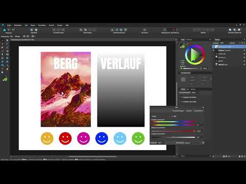
Before you get started, you should know that both adjustment layers affect the entire document. If you want to limit the result to a specific object, you have to arrange the layer accordingly or assign the layers deliberately. The following steps use a sample document with a photo and simple smiley vector objects so that you can see the color changes directly.
Step 1: Open an Adjustment Layer
First, make sure that no layer is selected in the Layers panel. Then click the adjustments menu at the bottom of the Layers panel. There you will find all available layers, including HSL and Vibrance. First select HSL to get to know how the layer works.

Step 2: Understand the HSL Dialog
After selecting it, the HSL layer dialog opens. The abbreviation stands for Hue, Saturation, and Lightness. All three values can be adjusted using sliders in this dialog. So you don't have to select anything in the image itself to influence the colors.

Step 3: Check the Effect on the Entire Document
The new adjustment layer sits at the very top of the Layers panel. As a result, it affects all layers below it, meaning the entire document. If you move or delete the layer, the result changes accordingly. Keep this position in mind when you work with multiple layers.
Step 4: Shift Hues
The hue slider is the first thing you should try. In the example, the smiley that was originally red is now blue after shifting. A yellow smiley moves toward magenta or pink. The hue slider thus works like a color wheel in which all colors shift simultaneously. If you move the slider slowly, you can see the change happen smoothly.
Step 5: Observe the Changes in the Image
As you move the slider, the smileys continuously change their colors. At first glance this seems playful, but it shows you exactly how strongly the hue slider intervenes. For a subtle correction, for example with a photo that has a slight color cast, small movements are often enough.
Step 6: Reset Settings
If you have changed too much, you can use the Reset button to set all values back to their defaults. This way you keep an overview and don't have to laboriously move each slider back individually. This is especially helpful if you want to compare different settings.
Step 7: Adjust Saturation with the HSL Layer
With the saturation slider, you increase or decrease the color intensity in the entire image. If you drag the slider all the way to the left, you get a black-and-white image. However, the effect is quite strong. Even small exaggerations lead to visibly oversaturated colors. That's why you should move the slider carefully and in small steps.

Step 8: Switch to the Vibrance Layer
If the HSL layer reacts too strongly for you, close the dialog and delete the HSL layer from the Layers panel. Then open Vibrance via the adjustments menu. You can recognize it by the single slider offered in the dialog.
Step 9: Increase Saturation Carefully
The Vibrance layer has a single slider that you can use to adjust the saturation. Drag the handle in the middle to the right to increase the saturation. The image is not displayed as oversaturated in the process. The brown tones in the photo in particular then look somewhat stronger, without the result looking unnatural.
Step 10: Compare Before and After
To check the effect, briefly hide the Vibrance layer and show it again. This way you can immediately see how the image has changed. Subtly less saturated areas now look somewhat more colorful, while highly saturated areas remain largely unchanged.
Step 11: Understand How Already Saturated Colors Are Protected
The trick of Vibrance is that it protects highly saturated colors. If you increase the saturation, colors with low saturation are boosted, while colors that are already strong hardly increase any further. As a result, no oversaturation occurs, even if you drag the slider further to the right.
Step 12: Reduce Saturation
If you move the slider to the left, it is mainly the saturation of the already strong colors that is reduced. Vibrance is thus also a gentle tool for calming down dominant hues without making the entire image look gray.
Step 13: Comparing HSL and Vibrance
The most important difference lies in the intensity. The HSL layer intervenes strongly in all colors and is suited for pronounced corrections or creative effects. Vibrance works more gently and is the better choice if you want to raise the saturation carefully. If you increase the saturation too much with the HSL layer, the result quickly looks oversaturated.

Summary – Affinity Designer: Controlling Saturation with HSL and Vibrance
You have seen how you can specifically change hues, saturation, and brightness in Affinity Designer with the HSL layer. The layer affects the entire document and reacts noticeably, which is why you should use it in moderation. The Vibrance layer complements it with a single slider that protects highly saturated colors and therefore leads to more natural results. For gentle corrections to photos or vector graphics, it is usually the first choice, while you turn to the HSL layer for color shifts and more pronounced adjustments.
FAQ
Does an adjustment layer only affect a single object?No, adjustment layers by default affect all layers below them. If you only want to edit a specific object, you have to arrange the layer accordingly or design the object separately.
Can I adjust the HSL layer again afterwards?Yes, adjustment layers are retained in the Layers panel. You can open them at any time, change values, or hide the layer again.
Why does HSL saturation quickly look exaggerated?The HSL layer boosts saturation evenly across all colors. Colors that are already saturated are raised just as strongly as pale ones, which is why even small exaggerations become visible.
What exactly does the Vibrance layer do?Vibrance mainly increases the saturation of colors with low saturation and protects highly saturated areas from further boosting. This results in a more even and natural result.
How do I reset the values of an HSL layer?Open the dialog of the HSL layer and click the Reset button. All sliders then return to their default values.


