
If you have already worked with Levels, you know the basic principle: shifting brightness values to change the contrast. The Curves adjustment builds on this principle, but gives you much finer control. Instead of three coarse sliders, you shape a curve that influences each tonal range individually. This lets you not only control contrast more precisely, but also shift colors in a targeted way and fundamentally change the look of a layer. This guide takes you from the first curve through the S-curve to color control via individual channels, and shows you how to use the adjustment as a clipping mask.
The video is only loaded from YouTube when you play it – data (including your IP address) is then transmitted to YouTube/Google. More in the privacy policy
Key Takeaways
- The Curves adjustment is an adjustment layer that is placed at the top of the Layers panel and remains editable at any time.
- The diagonal connects the shadows at the bottom left with the highlights at the top right. Anchor points on this line deform the curve.
- An S-curve increases contrast because it brightens light areas and darkens dark areas.
- With the Luminosity blend mode, you increase contrast without changing saturation.
- The eyedropper sets anchor points directly on the image, and a right-click removes them again.
- Via the Red, Green and Blue channels, you tint images or elements in a targeted way. The RGB/CMY mnemonic helps with this.
- As a clipping mask, the adjustment only affects the element below it.
Step-by-Step Guide
Step 1: Creating the Curves Adjustment
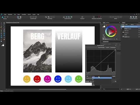
Start by creating the adjustment layer via the Adjustment menu. If you have no layer selected in the Layers panel, the Curves adjustment automatically ends up at the very top. In the dialog box, you see the histogram in the background, that is, the tonal distribution of your entire document: on the left the shadows down to pure black, on the right the highlights up to pure white. Unlike with Levels, the adjustment appears as a diagonal with two handles.

Step 2: Understanding the Structure of the Curve
The diagonal has two handles at its ends: bottom left for the shadows and top right for the highlights. In between lies the connecting line, which you can freely deform. This line is the core of the Curves adjustment, because every change to it affects specific tonal values. That is why the adjustment is called Curves.

Step 3: Increasing Contrast via the Corner Points
Drag the bottom left handle to the right and the top right one to the left. All tonal values to the left of the lower point thereby become pure black, and all tonal values to the right of the upper point become pure white. In principle, this corresponds to moving the sliders of Levels. You may exaggerate here: with extreme settings, you end up with an almost pure black-and-white image with maximum contrast. Don't worry, this can be undone at any time.

Step 4: Controlling Midtones via Additional Anchor Points
You can place further handles on the diagonal, for example for the midtones in the middle. If you drag this point downward, the midtones are strongly darkened, while shadows and highlights are less affected. The curve drops noticeably in this area. If you drag the point upward, you brighten the midtones. Depending on how far you move the handle, stronger or gentler gradients result.
Step 5: Editing Shadows, Midtones and Highlights in a Targeted Way
Set an anchor point in the area of the dark tones and drag it downward to darken the dark tones further. At the upper end, you can brighten the light areas by dragging a handle upward. If you leave the handle in the middle unchanged, the midtones are preserved, and you only work on the edges. This technique is particularly suitable for gentle contrast increases where you do not want to alter the image as a whole.

Step 6: Creating an S-Curve for More Contrast
Set another anchor point in the lower area and drag it downward to additionally darken the dark areas. At the top, you set another handle and drag it upward. This creates an S-curve: light areas become lighter, dark ones darker, and the contrast in the image increases significantly. You can also be more aggressive here, but you should continuously check the effect in the image so that details are not lost.

Step 7: Adjusting the contrast without changing the saturation
If the color intensity should remain unchanged, set the blend mode of the curves layer to Luminosity. The contrast still increases, but the saturation in the image is not boosted. For the next steps, set the mode back to Normal. With a click on Reset, you can return to the straight diagonal at any time.

Step 8: Working directly on the image with the eyedropper
The eyedropper button determines a specific tonal value in your image. If you activate it and click on a spot in the image, the curve sets a new anchor point at exactly that spot. You can then move it directly to specifically lighten or darken that area. This way you don't have to laboriously search for the right point on the curve.
Step 9: Removing unwanted anchor points
An anchor point you no longer like can be removed with a right-click on the point. It disappears from the curve immediately, and the rest of the adjustment is retained. This way you can try out the eyedropper without committing.
Step 10: Controlling colors via the individual channels
In the menu above the graph, you switch from the Master area to the individual channels. There you can adjust Red, Green and Blue separately. This way you change not only the contrast but the color of the document or element. This allows you to create entire moods, such as a warmer or cooler look.
Step 11: Using the RGB and CMY mnemonic
The channels Red, Green and Blue are closely linked to the colors Cyan, Magenta and Yellow. Adding red means you mix red into the image. If you remove red, you add cyan. It works the same way with green: if you remove green, magenta is added. With blue, you remove the blue and get yellow. The order RGB and CMY is therefore easy to remember.
Step 12: Adding red and cyan specifically
Select the red channel and click in the middle of the diagonal. If you drag the anchor point upward, you add red to the document, and the hue shifts visibly. If, on the other hand, you drag a point downward below the diagonal, you add cyan. With a right-click you remove the point again when it is no longer needed.

Step 13: Combining green and blue
For the next color, switch to the green channel. If you drag a point upward there, you add green; downward, you add magenta. In the blue channel, the blue increases by raising the point, while lowering it adds yellow. If you combine the channels with each other, images or individual elements can be tinted very specifically.
Step 14: Using the adjustment as a clipping mask
If you want the change to affect only a specific image, drag the curves layer as a child layer directly onto the image. It thereby becomes a clipping mask and affects only this element. With a double-click on the layer, you open the settings again and can continue fine-tuning.

Step 15: Brightening dark areas and protecting midtones
If you drag the handle for the shadows upward, you brighten the dark areas. However, the image quickly looks milky as a result. So that the midtones are not changed too much in the process, you set additional anchor points and drag them downward. This way you mainly brighten the dark areas, while the rest of the tonal range remains stable.
Step 16: Comparing before and after
Hide the layer once to see the original state, and show it again to check the result. This way you immediately see how much the curve has changed the image. With this tool, you can adjust the contrast, tint an image, brighten dark areas or darken bright areas. It is worth starting with small steps and checking the effect again and again.
Summary ??? Curves in Affinity Designer: Controlling contrast and colors
With the curves adjustment, you work much more precisely than with the levels adjustment. You move corner points, set anchor points on the diagonal and thus shape shadows, midtones and highlights individually. The S-curve increases the contrast, the Luminosity blend mode prevents unwanted saturation jumps, and the eyedropper sets points directly on the image. Via the Red, Green and Blue channels, you can shift colors specifically, with the RGB and CMY mnemonic helping you. As a clipping mask, the adjustment affects only the desired element.
FAQ
What distinguishes the tone curve from the levels adjustment?The levels adjustment works with three sliders, whereas with the tone curve you can set as many anchor points as you like and thus precisely control individual tonal ranges.
How do I remove an anchor point on the curve?Right-click on the anchor point, and it will disappear from the curve.
Why doesn't the saturation change with the Luminosity blend mode?The Luminosity blend mode only transfers the brightness change to the image, while the color components remain largely preserved. As a result, the contrast increases without the colors becoming more intense.
How do I make the tone curve affect only a single element?Drag the adjustment layer as a sublayer directly onto the desired element. It then becomes a clipping mask and affects only that element.


