
A photo looks flat, a gradient loses its depth, and the white text suddenly disappears into the bright areas. With the Levels adjustment layer in Affinity Designer, you can fix such problems without changing your original layers. The settings can be reopened and readjusted at any time. In this tutorial, you will learn how to create the layer, use the black and white levels, keep an eye on saturation, and limit the effect to individual layers.
The video is only loaded from YouTube when you play it – data (including your IP address) is then transmitted to YouTube/Google. More in the privacy policy
Key Takeaways
- Adjustment layers affect the tonal values without permanently changing the layers beneath them.
- Depending on its placement, the Levels adjustment affects the entire document or only a single layer.
- You control contrast and brightness using the histogram and the sliders for the black and white levels.
- Too much contrast often also increases saturation. With the Luminosity blend mode, you separate brightness from color.
- With a clipping mask, you limit the adjustment to exactly the layer you want to edit.
Step-by-Step Guide
Step 1: Create the adjustment layer via the Layers panel
You get started via the Layers panel. At the bottom, you will find the icon for adjustments. When you click it, a menu opens with all available adjustment layers. Select Levels there. The layer then appears as its own layer in your panel and shows you that it can influence the document.

Step 2: Work on the whole document or in a targeted way
Adjustment layers are suited to two areas of use. You can edit the entire document or target individual elements such as a photo, a gradient, or individual graphics. So decide in advance which area should be changed, because the placement of the layer in the Layers panel depends on it.
Step 3: Select Levels
Open the menu for adjustment layers again and click Levels. As soon as you select the layer, its dialog window opens. There you make all further settings.

Step 4: Understand the placement of the layer
If you have not selected any other layer, the adjustment layer is automatically placed at the very top of the Layers panel. As a result, it affects all layers beneath it, that is, the entire document. If, on the other hand, you select a layer beforehand, for example a rectangle, the Levels adjustment is automatically placed as a sublayer or clipping mask within that layer. This is not a mistake but a feature that you can use deliberately.
Step 5: Move the layer to the top for the entire document
If you want the adjustment to affect all layers, drag the Levels adjustment out of the clipping mask and place it at the very top of the Layers panel. From that moment on, the changes affect all layers below the adjustment layer.
Step 6: Reopen the dialog box
You can close the dialog box at any time without losing the settings. To edit the values again, double-click the thumbnail of the adjustment layer in the Layers panel. This brings the dialog box back up and you can continue working.

Step 7: Read the histogram
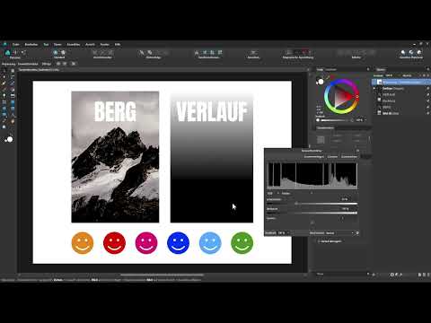
In the dialog box you see a histogram. It shows the current tonal distribution of your entire document from dark on the left to bright on the right. So black is on the left, white on the right. Based on this distribution, you can see where information lies in the image and where the contrast can be pushed further.
Step 8: Adjust the dark areas with the black level
Below the histogram you will find two sliders: the black level and the white level. With the black level, you determine which tonal values are displayed as pure black. If you drag the slider to the right, the dark areas are darkened further. You see the change live in the document, that is, in the photo, the gradient, and the smileys.
Step 9: Use the gradient as a control tool
A black-and-white gradient is well suited for checking the effect of the sliders. With the default setting, you see a smooth transition from black to white with even shades of gray. If you move the black level to the right, the boundary to pure black moves upward. All tonal values to the left of the resulting white line are then displayed as completely black. As a result, the visible gradient only begins later.

Step 10: Increase the Contrast with the White Level
The white level works in the opposite way. If you move the slider to the left, bright areas are brightened further. With this combination of black and white levels, you significantly increase the contrast of an image. If you move the sliders far enough, the areas beyond the limits become pure black or pure white.

Step 11: Keep an Eye on Lost Details
With strong settings, information can be lost. In the example, the white text disappears completely as soon as the white level is pulled too far to the left, because it merges with the pure white of the background. If you pull the slider back, the text reappears. Therefore, always make sure that important details remain visible.

Step 12: Assess the Maximum Contrast
With extreme values, you achieve a very strong contrast. If you exaggerate the settings, you even get a true black-and-white image. This state represents the highest possible contrast. For most projects, however, it is too harsh, so a careful approach is usually the better choice.

Step 13: Recognize the Side Effect on Saturation
Increasing contrast with the levels adjustment often also increases saturation. Browns and earth tones in the photo become more intense, and the smileys quickly look like neon colors. If you undo the change, the image looks much more subdued again. Therefore, always watch the colors when adjusting, not just the brightness.
Step 14: Use the Luminosity Blend Mode
To avoid changing the saturation as well, you can change the blend mode of the adjustment layer. You can do this either at the top of the Layers panel or at the bottom of the dialog box in the Blend Mode section. If you set the mode from Normal to Luminosity, the contrast increase affects only the brightness. The colors remain unchanged. Whether you like this result better is something you decide in the end yourself by comparing both variants.
Step 15: Limit the Adjustment to a Single Layer
If the levels adjustment should affect only a specific element, such as a photo of a mountain, drag the adjustment layer directly above that layer. Make sure that the blue bar is shifted to the right so that it is assigned as a clipping mask. Then release the layer. A small arrow on the image layer shows you that the clipping mask has been created.

Step 16: Check the Result
After creating the clipping mask, your adjustment affects only the photo. The gradient and the smileys remain unchanged. Open the arrow on the image layer to check the assignment, and adjust the values again if needed.
Step 17: Use Adjustment Layers for Testing
Adjustment layers are also suitable if you want to check a finished document. Place a levels adjustment over the entire layout and test whether it looks better a bit darker, lighter, or with more contrast. Since the layer can be removed or adjusted at any time, you lose nothing of your design in the process.
Summary ??? Using Levels Adjustment in Affinity Designer Effectively
The levels adjustment is an adjustment layer with which you can change the brightness and contrast of your document or of individual layers. With the histogram and the two sliders for black and white levels, you keep the tonal distribution in view. The placement in the Layers panel determines whether the adjustment affects the entire document or only one layer. With strong settings, watch out for lost details and for saturation. With the Luminosity blend mode, you change only the brightness and keep the colors as they are.
FAQ
How do I open the levels adjustment in Affinity Designer?Click the adjustments icon at the bottom of the Layers panel and select the levels adjustment from the menu.
How can I edit the levels adjustment again later?Double-click the thumbnail of the adjustment layer in the Layers panel. The dialog box opens again and you can change the values.
How do I make the levels adjustment affect only a single photo?Place the adjustment layer directly above the image layer so that it is assigned as a clipping mask. A small arrow on the image layer shows you the assignment.
Why do the colors become more intense with higher contrast?Increasing contrast with the levels adjustment often also increases saturation. To avoid this, set the blend mode to Luminosity.
What does the Luminosity blend mode mean for the levels adjustment?The Luminosity mode ensures that the contrast increase affects only the brightness and the color saturation remains unchanged.
Why does my light text disappear with strong contrast?If the white level is pulled too far to the left, bright areas become pure white. Light text on a light background then merges with the background. Pull the slider back a little until the text is visible again.


