

A new look for a finished image often takes just a few clicks. You don't have to be a color grading pro to do it. With a Solid Color adjustment layer and a brush, you can give your subject its own color mood in a short time. In this tutorial, you will learn both methods and find out how to combine them so that the result looks lively yet still harmonious.
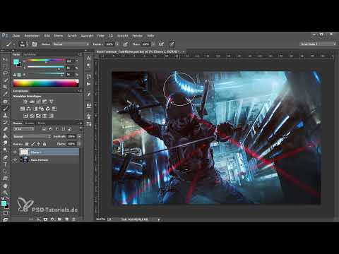
The video is only loaded from YouTube when you play it – data (including your IP address) is then transmitted to YouTube/Google. More in the privacy policy
The foundation is a clean composite. You should have already completed the masking, tonal values, and the integration of the person into the background beforehand. A color look cannot hide mistakes in the composite; rather, it tends to amplify them.
Key Takeaways
- A Solid Color adjustment layer with the Soft Light blend mode is the fastest way to a color mood.
- Opacity and blending via the layer styles ensure that the color doesn't look overwhelming and that the contrasts are preserved.
- With the brush on an empty layer, you can apply colors specifically to certain areas.
- A Gaussian Blur as a Smart Filter merges the color transitions, and a layer mask allows you to correct areas afterwards.
Step-by-Step Guide
Check the Starting Point
Before you start with the color look, you should have a good overview of your image. Make sure your composite is complete, the model fits well into the background, and the tonal values are right. Only then is it worth moving on to the color design.

Create a Solid Color as an Adjustment Layer
Open the adjustment layers panel at the bottom of the Layers area. At the very top of the list you will find Solid Color. Click on it. Photoshop places an opaque fill over your image, which initially covers everything. Don't worry, that's normal. The fill only takes effect in the next step.

Set the Blend Mode to Soft Light
Set the blend mode of the Solid Color layer to Soft Light. This combines the color with the brightness values of your image, and you immediately see how the look works. Also try out the other modes. However, Hard Light is too extreme in this example and is usually not suitable.

Find the Right Color in the Color Dialog
Double-clicking the layer's color swatch opens the color picker. On the left you see the field with brightness and saturation. From top to bottom you change the brightness, from left to right the saturation. On the right, in the color bar, you choose the hue. Move slowly through the hues until you like a direction. In this example it is a blue-violet that suits the mood well. Then confirm with OK.

Soften the Color Look via Opacity
If the look is still too intense for you, you can reduce the opacity of the layer. This is the simplest way to control the strength of the color.

Bring Back the Color with Blending via Layer Styles
The most important trick in this tutorial is blending. To do this, click with the mouse on the empty area of the Solid Color layer, not on the icon or the name. This opens the layer styles. In the Blend If section, you can control the image using the black values and white values of the underlying layer. First drag the sliders toward the center. When you move the slider for the dark tones, hard edges appear. Therefore, hold down the Alt key and then drag the slider apart. This splits the slider, and you can set the transitions to be soft. The dark tones thereby return from the lower layer, and the color look appears more natural again. You work with the light tones in exactly the same way.
With this technique you keep the contrasts, and the image no longer looks so washed out. You should use this step with almost every color look.


Building the color look with the brush on an empty layer
The second method is suitable if you already know fairly precisely where the color tint should go. To do this, create an empty layer and select the brush. Using a light color, for example a lighter blue, place color areas in the regions you want to emphasize. In the next step, take a darker violet for the edges and a third color, such as a royal blue, for the area of the model. You can leave the opacity at 100 percent for now. The colors don't have to fit perfectly, because you will tone them down later.
Setting the brush look to Soft Light
Set the layer mode of the brush layer to Soft Light. The image now looks colorful, and the look differs clearly from the first method. However, the transitions between the color areas are still too hard, and you will work on that in the next step.

Blending the color areas with a Smart Filter
To make the transitions softer, first convert the brush layer into a Smart Object. This way you can readjust the filter at any time later. Then go to Filter in the menu, choose Blur filters, and select Gaussian Blur. Push the radius up far enough that the colors blend nicely. You will immediately see how the transitions become softer. A double-click on the Smart Filter takes you back to the settings at any time.

Limiting the blur in a targeted way with a layer mask
The Smart Filter initially affects the entire layer, including areas you don't like. Therefore, add a layer mask. Paint with black on the mask to remove the filter again in those places. To check, you can paint with 100 percent opacity in between so you can see exactly what is happening. If you set the foreground color to white, you restore the filter wherever you want it. If the blending is too strong overall, you can reduce the Gaussian Blur in the Smart Filter at any time.

Readjusting the color intensity with a Hue/Saturation layer
The disadvantage of the Smart Filter method: you can no longer control the colors as precisely. With a Hue/Saturation layer above the brush layer, you regain this control. You can increase or decrease the saturation and change the hue completely. However, plan in advance which direction your look should go, otherwise you will quickly get lost in experiments.

Harmoniously fine-tuning the final look
Finally, here too you blend out a bit via the layer styles of the layer so that the color doesn't come across too strongly. The result remains intense but looks more harmonious overall. Compare your look with the original from time to time so that you don't overdo it.

Summary ??? Color look in Photoshop: Creating a color mood with a color fill and brush
You have now learned two ways to quickly give an image a color look. With the Solid Color adjustment layer set to Soft Light, you achieve a clear look that can be controlled well via opacity and blending. With the brush on an empty layer, you shape the colors more precisely, and with a Smart Filter, layer mask, and Hue/Saturation, you refine the look. It's best to try both methods on one of your own images and then decide which suits your style better.
FAQ
Does the composing have to be finished before the color look?Yes, that is recommended. If the tonal values and the integration of the model are not right, the color look amplifies these errors.
Why does my image look completely colored after creating the color fill?The color fill is initially opaque. Set the layer mode to Soft Light, then it combines with the brightness values of the image.
Why do hard edges appear when blending?If you move the slider for the blend values without the Alt key, hard breaks appear. Hold down the Alt key and split the slider, then the transitions become soft.
Can I still change a brush color look later?Yes. Since the layer exists as a Smart Object with a Smart Filter, you can adjust the blur at any time. With a Hue/Saturation layer, you control the colors afterwards.
Which method is better suited for beginners?The Solid Color adjustment layer is quicker to implement and requires less preparation. The brush method offers you more creative control, but requires more precise planning.
Why shouldn't I leave the opacity too high?A color look at 100 percent opacity quickly looks exaggerated and swallows contrasts. A reduced opacity lets the image look lively but controlled.

