
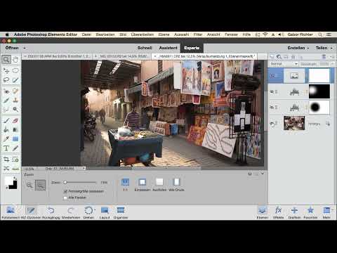
A photo full of colors looks lively at first glance, but it often distracts from the actual subject. This street scene has exactly this problem. The colors draw attention to themselves, yet the strength of the image lies in a man who is out and about with his cart, looking skeptically into the camera, and whose shadow is cast nicely forward by the sun.
The video is only loaded from YouTube when you play it – data (including your IP address) is then transmitted to YouTube/Google. More in the privacy policy
In this tutorial, you will learn how to develop your own image look in Photoshop Elements that is limited to two color tones: a deep anthracite for the shadows and a warm sand tone for the highlights. You will combine several tools, namely adjustment layers, layer masks, gradient maps, and the Spot Healing Brush. All steps build on one another, so you can always understand why an image looks the way it does.
Key Takeaways
Focus is created through brightness. A darkened surrounding area and a deliberately brightened zone guide the viewer's eye to the main subject.
Adjustment layers with masks remain editable at any time. You can still adjust darkening, brightening, and color effects later without damaging the original photo.
The gradient map is the heart of the image look. With it, you determine which tones are assigned to the shadows and which to the highlights.
At the end, you can remove small distractions with the Spot Healing Brush. This makes the image look tidy without appearing artificial.
Step-by-Step Guide
Step 1: Define the idea behind the image look
Before you touch any tool, think about what the image should convey. Mentally remove the colors and ask yourself where the viewer's gaze should land first. In this example, it is the man with the cart. Your goal is therefore a look made of two colors, namely black or anthracite and an orange or sand tone. This two-color approach feels calm and does not distract, so the mood of the subject moves to the foreground.

Step 2: Place a vignette around the subject
So that the eye travels to the man, you slightly darken the surroundings. To do this, create a Levels adjustment layer. From it, you create a selection with a feather, which you set to a value of 250. The feather ensures that the transition between light and dark does not look harsh. Then pull the tonal values down until the darkening looks noticeable but not exaggerated.

Step 3: Shift the darkening to the outside
On the first attempt, the darkening is usually in the center of the image, exactly where you don't want it. Therefore, press Ctrl+I or Command+I to invert the mask. After that, only the outer area is darkened, and the subject stays bright. If you would like to weaken the darkening a little more, reduce the opacity of the layer or adjust the tonal values again.

Step 4: Position the mask precisely with Transform
A big advantage of masks is that you can change their shape and position at any time. Select the mask and press Ctrl+T or Command+T. Afterwards, the vignette can be moved, enlarged, or reduced. Confirm your changes with the Enter key. This way you determine exactly how much of the subject remains uncovered and how far the darkening extends.

Step 5: Direct the light specifically onto the man
With a second selection, you can strengthen the focus even more. Again create a selection with a feather of 250 and add a Levels adjustment, this time however for brightening. Pull the sliders up until the desired area looks clearly brighter. With Ctrl+T or Command+T, you can then move the brightening to the right spot and adjust its size. Afterwards, compare the image before and after the change. The gaze should now clearly rest on the man.

Step 6: The Gradient Map as the Basis for the Two-Color Look
Now comes the crucial step. Create an adjustment layer of the type Gradient Map. At first, the result usually looks unusable, because the colors of the image are heavily distorted by the default gradient. Don't let that discourage you, because the gradient is only the starting point. In the gradient bar, you can click on each color stop and change the color. For example, first choose black and white so that you can assess the brightness distribution.

Step 7: Checking the Effect of the Black-and-White Look
Once you have set the gradient to black and white, it becomes clear whether the subject actually works. First look at the image without the additional lighting corrections and then with them. To do this, simply disable the visibility of the layers by clicking the eye icon. This way you can see what influence each layer has on the mood. In this example, the black-and-white version already looks very balanced.

Step 8: Defining Shadows and Highlights in Color
To give the image its final finishing touch, you specifically tint the shadows. To do this, open the Gradient Map again and click on the color stop for the dark tones. Don't choose pure black here, but a dark anthracite, so that the look doesn't seem too harsh. You set the color stop for the light tones to a warm sand tone or a soft yellow. Make sure you pick the right color stops in the palette, because a new palette may appear with every click on the gradient. Confirm the changes with OK.

Step 9: Fine-Tuning the Brightness Distribution Afterwards
With the Gradient Map, you can still finely control the brightness distribution. Switch the layer on and off once to see the difference. The advantage of this approach is that you can shift, reposition, or swap the colors at any time. If you notice later that the highlights look too strong or the shadows too flat, you simply adjust the color stops without having to start over.

Step 10: Removing Distracting Details with the Spot Healing Brush
On close inspection, small distractions often stand out, such as cigarette butts or dirt on the asphalt. Select the bottom layer, i.e. the original image, so that your corrections are applied to it. Take the Spot Healing Brush, reduce the size, and remove the distractions with short clicks. If you remove too much, simply undo the step with Ctrl+Z or Command+Z. With details like cigarettes, patience pays off, because they quickly stand out in the black-and-white look. At the same time, you shouldn't overdo it, so that the image remains authentic.


Step 11: Saving the Result and Editing It Later
If you like the result, save your work as a project file. This preserves all adjustment layers, masks, and gradient maps. If you want the image look to be different later, simply open the file again and adjust the respective adjustment layer. This is exactly why working with layers is worthwhile: you don't have to rebuild anything, you just change the values that bother you.

Summary ??? Photoshop Elements Image Look: Setting Focus with a Two-Color Look
With adjustment layers, masks, a gradient map, and the Spot Healing Brush, you create an image look that puts the subject at the center. You begin with a vignette and a brightening to direct the focus. Then you reduce the colors to anthracite and sand tone and remove distracting details. All steps remain saved in layers, so you can rework the look at any time.
FAQ
Question: Why does my gradient map look so unusable at first?Answer: The default gradient heavily distorts the colors. It serves only as a starting point that you adjust via the color stops.
Question: What is the benefit of inverting the mask?Answer: Inverting darkens the outer area while the main subject stays bright.
Question: Can I still move the vignette later?Answer: Yes, with Ctrl+T or Command+T you can transform the mask at any time and confirm with the Enter key.
Question: Why shouldn't I use pure black for shadows?Answer: A dark anthracite looks softer and avoids harsh transitions, which quickly look unnatural in the image.
Question: I removed too much with the Spot Healing Brush. What can I do?Answer: Use Ctrl+Z or Command+Z to undo the last step, and reduce the size of the brush.
Question: How can I still change the image look after saving?Answer: Open the project file again and adjust the desired adjustment layer, since all layers and masks are preserved.


