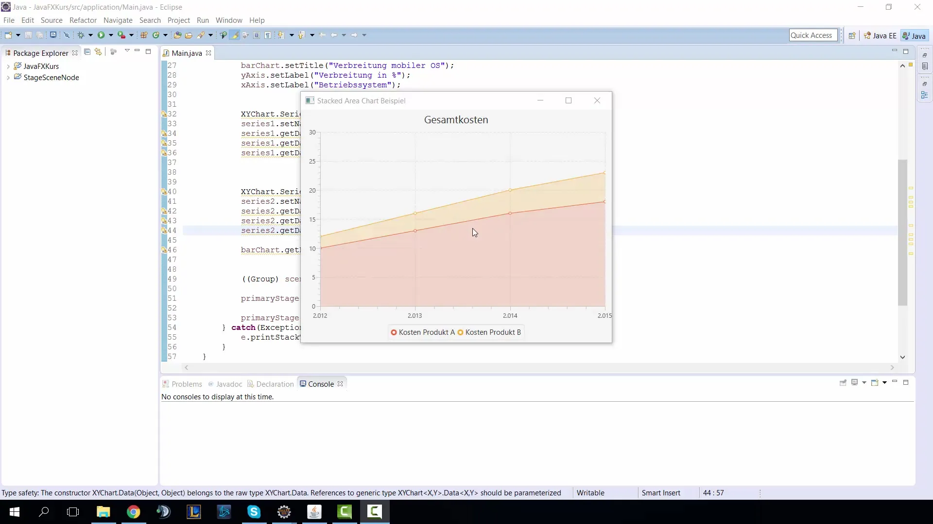
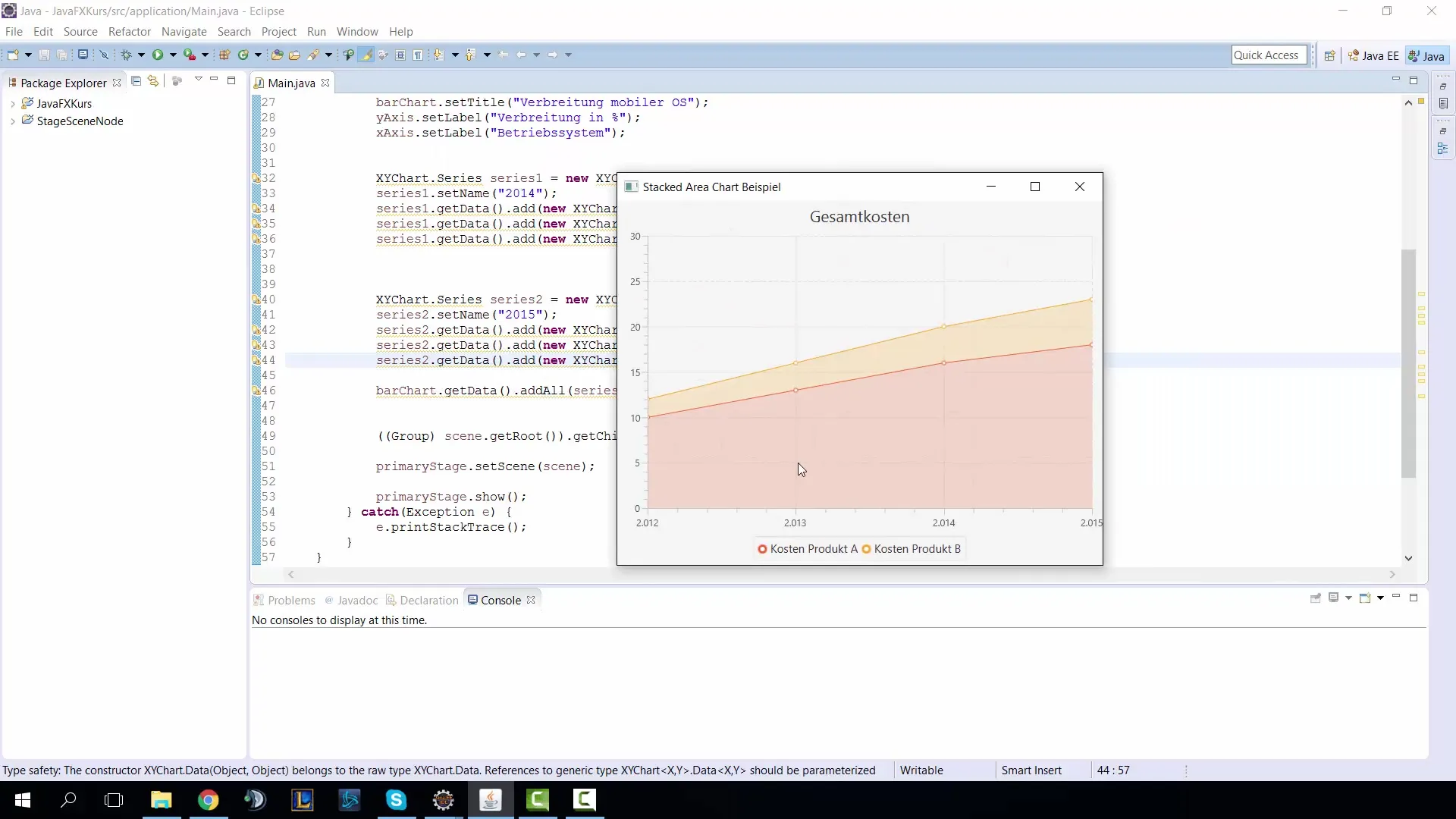
Stacked area charts provide a clear way to visualize data over different categories over time. In this tutorial, you will learn how to create a stacked area chart using JavaFX that allows you to visualize the development of various metrics. This is particularly useful when you want to analyze the costs of different products over time.
Main Takeaways
- A stacked area chart displays the summed values of multiple series.
- The visualization allows for easy recognition of trends and development over time.
- Configuring the axes is crucial for the correct representation of the data.
Step-by-Step Guide
Start by setting up the basic structure of your JavaFX project. You should ensure that the required library files are imported into your project. This is the first step in creating the area chart.
Then, create a new JavaFX application and set the title of your main window. You can do this with the command primaryStage.setTitle("Area Chart Example");. Choose a concise title that appropriately describes the content of the chart.

Now specify the data to be used. You want to define the data for two series: revenue and profit. Think about how you want to structure this data, for example, by defining the years to which the values apply.
The next goal is to define the x-axis and y-axis for your chart. You should ensure that both axes are configured as numerical axes since you are working with numbers. This is a fundamental step to ensure that the data can be displayed correctly.
Now create the basic framework for the area chart. You will use NumberAxis for both axes and specify that the chart is an AreaChart instance. Don’t forget to link the axes to the chart.
Set the data for the x-axis and y-axis by assigning labels for the years and the values in Euros. This ensures that users can easily understand the information presented.
Test the functionality of your area chart. Pay attention to whether the data is displayed correctly. It can be helpful to adjust existing data to check the adaptability of your chart.
Now that your base chart is ready, take a step further and create the stacked area chart. Here you need to ensure that you use the correct methods for stacking the data. Note that you are working with StackedAreaChart and you need to adjust the implementation accordingly.
Change the field names and axis titles so that they are suitable for the stacked chart. For example, you might change the titles to “Total Costs” to clearly indicate that you are representing the accumulated costs of Product A and Product B.
Now you should define the data for the two products and ensure that they are presented correctly in your stacked chart. For instance, Product A might represent the experiences and costs of a specific item, while Product B could show a different cost category.
To verify that the implementation of your stacked area chart works as desired, run the program and take a look at the generated graphic. Check whether the data is accurately labeled and can be meaningfully interpreted.
If everything works correctly, you can add additional customizations to your stacked area chart, such as colors for the series to improve readability. This helps users clearly differentiate the data.

An important aspect you should not forget is to adjust the y-axis, especially if the values vary greatly. Make sure that the axis ranges are set correctly to ensure the best results and readability of the chart.
Summary – Stacked AreaChart in JavaFX
Stacked area charts provide a clear way to visualize data. In this tutorial, you learned how to create such a chart in JavaFX to represent developments of metrics like revenue and profit. You should now be able to implement similar charts in your applications.
Frequently Asked Questions
How do I create a simple area chart in JavaFX?You can create an area chart in JavaFX by creating an instance of AreaChart, defining the axes, and adding the data for the series.
What is the difference between an area chart and a stacked area chart?An area chart shows the data of all series in separate colors, while a stacked area chart sums the data and displays it on top of each other, showing how the total values change over time.
How can I customize the appearance of my stacked area chart?You can customize the appearance by adding axis titles and labels, choosing colors for each series, and adjusting the values to present clearer information.


