
A video without an on-screen text overlay often feels incomplete, whether for a name tag, a title, or a note on the screen. Premiere Pro offers its own text tool for this, which seems a bit unwieldy at first glance. But once you have understood how text is created in the timeline and where the settings are located, you will handle it quickly and confidently.
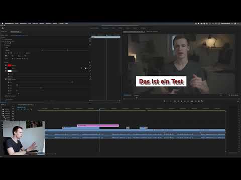
The video is only loaded from YouTube when you play it – data (including your IP address) is then transmitted to YouTube/Google. More in the privacy policy
In this guide, I will show you step by step how to create a text, style it, add a background and shadow, and center it exactly. You will also learn how to use a vertical text tool and why it makes sense to create a separate layer for each text.
Key Takeaways
Text is created directly in the viewer, not by dragging it into the timeline. Position the playhead at the right spot beforehand, because that is where the new text layer will be created. You will find the settings in the "Text" tab of the effect controls. To change individual words or characters, you must select the text first. For an exact center in a 4K video, set the X position to 1920. Create a separate layer for each text so that you can edit it independently later.
Step 1: Activate the Text Tool
Getting started is quick. You activate the text tool either with the T key or by clicking it in the toolbar. Make sure the effect controls are clearly visible, because later you will often work back and forth between the viewer and the settings window. The Effect Controls panel can be made smaller if needed so that you have more room for the video image.

Step 2: Write the Text in the Viewer
With the text tool active, you click directly on the spot in the video image where the text should appear. A red text box opens, and you can start typing right away. Your text sits on top of the image, similar to an image editing program.
In this step, be sure to pay attention to the position of the playhead in the timeline. Only once you have written something does Premiere create a new graphics layer at the top above your clips. If the playhead is in the wrong place, the text will start exactly where you didn't want it. You can move, extend, or shorten it, but it saves you time to choose the right position from the start.

Step 3: Find the Text Layer in the Effect Controls
Once the text is in place, you switch to the effect controls. There, under the graphics, you will find a new tab called "Text". Here Premiere bundles all the settings you need for your text. The options are extensive, so it is best to work your way through them piece by piece.

Step 4: Font and Selecting Parts of the Text
You set the font in the "Text" tab. I like to use Lato in the Regular variant, but of course you can choose any font that suits your project. On your first attempt you may be disappointed, because at first nothing happens. This is because Premiere only changes the selected area.
To select text, you click on the text in the viewer several times. One click places the cursor, a double click selects the current word, and a triple click selects the entire text. After that, you can change the font. This principle is important, because it allows you, for example, to enlarge only the first word without affecting the rest.
Step 5: Adjust the Font Size
Size is one of the most important adjustment levers. In the example, I set everything to font size 200 so that the changes are clearly visible in the image. For your overlay, of course, you choose a value that remains legible without dominating the image. Select the text beforehand if you only want to change parts of it.

Step 6: Set Alignment, Tracking, and Text Style
In the "Text" tab you will find further options for alignment and typography. You can align the text left, right, or centered. For most overlays, this setting is already enough. In addition, you can force uppercase letters, change character spacing, set characters as superscript or subscript, and underline text. The possibilities are very varied, but in everyday work you usually only need the alignment and the font.
Step 7: Designing the Fill and the Background
The fill determines the color of your text. If you want to make the text red, you select it and choose the desired color. Without a selection, the fill applies to the entire text, which gives you a quick overall color.
The background is a bit trickier. When you activate it, a shape is placed behind the text. With the two sliders for opacity and border width, you control the effect. At 0% opacity, the background remains invisible; at 100%, it is fully opaque. When you enlarge the border, the shape looks larger and can highlight the text well. As long as you still have the text selected, you often can't see the background properly, so briefly switch to the Selection Tool to check it.
Step 8: Using Stroke and Shadow
With the stroke, you add an outline around the letters. Make sure it doesn't get too thick, otherwise the text quickly looks like WordArt from an old word processor. The shadow sits between the background and the text and creates depth. You can adjust its width, angle, distance, and opacity. The angle determines where the imaginary light source comes from and thus influences the three-dimensional impression.

You don't have to use all the effects at the same time. Often white text without a stroke and without a background is enough, possibly with a subtle shadow. Try out different combinations until the result suits your video.
Step 9: Centering the Text Precisely
You may notice that after centering, the text is not really in the middle of the frame. This happens because the anchor point is not automatically located in the center of the video. The solution is through the Transform settings. There you will find the Position with the values X and Y. The X value moves the text horizontally, the Y value vertically.
For a 4K recording with a width of 3840 pixels, the center is at 1920 pixels. So set the X value to 1920, and the text will sit exactly in the middle. You set the Y value according to your desired height.
Step 10: Using the Vertical Type Tool
There is also a second tool. Press and hold the Type Tool in the toolbar, and the Vertical Type Tool appears. It is more than just a 90-degree rotation, because it makes the letters stack one below the other. Be careful that, with text that is already selected, you don't accidentally write everything into a single text layer. That quickly looks cluttered.

Step 11: Creating a Separate Layer for Each Text
My most urgent tip at the end: Create a separate layer for each text. To do this, simply deselect the selection, click again in the Viewer with the Type Tool, and write the next text. This gives you an additional text layer that you can move, extend, and change independently of the first. Even if it quickly becomes many layers, you save yourself a lot of frustration later if you want to change an individual text afterward.
Summary – Mastering the Premiere Pro Type Tool: The Guide
You now have an overview of all the important functions of the Type Tool. You know how to create text in the Viewer, keep an eye on its position, adjust font and size, and select individual passages. You also know the options for fill, background, stroke, and shadow, as well as the way to the exact center via the Transform settings. The Vertical Type Tool and working with multiple layers round out the picture. With this knowledge, you create overlays that look clean and can be adjusted at any time. In the next step, you can additionally animate the texts.
FAQ
Why does nothing happen after changing the font?You have to select the text first, since changes only apply to the selected characters.
Where does the new text layer appear in the timeline?Premiere creates the text layer above your clips at the point where the playhead is when you write.
How do I place a text exactly in the center of the frame?In the Transform settings, set the X value to half the width of your video, so for 4K to 1920.
Can I also write text one below the other?Yes, with the Vertical Type Tool, which you find by pressing and holding the Type Tool.
Why can't I see the background properly?As long as the text is selected, the background is often hard to judge. Switch to the Selection Tool to check the result.
Should I use a separate layer for each text?This is recommended because you can edit, move, or change each text individually later.


