
The Creative section in the Lumetri panel of Premiere Pro is designed to give your footage its own look. While with the basic correction you match colors and fix errors, here you deliberately shape the visual impact. You decide whether your video should look cinematic, cool, warm, or washed out.
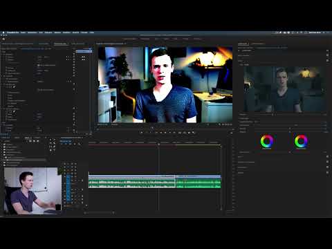
The video is only loaded from YouTube when you play it – data (including your IP address) is then transmitted to YouTube/Google. More in the privacy policy
This guide takes you step by step through all the important controls: from the look presets through intensity, sharpening, and Unsharp Mask to vibrance, saturation, color wheels, and tint balance. You will also learn why less is often more.
Key Takeaways
The Creative section changes the look of your video, while the basic correction serves technical matching. Presets are starting points whose effect you control via intensity. Sharpness can be controlled with the Sharpen slider, but more finely with Unsharp Mask using Amount, Radius, and Threshold. Vibrance has a gentler effect than saturation. Shadow and highlight tints allow a film look with complementary colors. Move all sliders only in small steps, because overly strong adjustments quickly destroy color information.
Step-by-Step Guide
Step 1: Open the Creative Section
In the Lumetri panel, open the Creative section. It is located directly below the basic correction. Once you work here, you have look presets, sliders for intensity and sharpness, as well as color controls at your disposal. It is important that you do not use this section to rescue footage, but regard it as a creative tool.

Step 2: Select and Compare Look Presets
In the Creative section you will find a dropdown menu with presets such as Monochrome or Kodak. These presets work like filters that are applied to your entire image. Feel free to click through the selection and watch the preview in the Program Monitor. This way you quickly discover which style suits your footage. A black-and-white look, for example, is created in just a few clicks, while other presets produce a warm, slightly faded, or high-contrast character.

Step 3: Adjust the Intensity of the Look
A preset is rarely perfect right away. In the example, the "SL Big" look appears too harsh and too heavily saturated. Instead of choosing another preset, you simply reduce the intensity. Even at 50 percent, a harmonious result often emerges: the skin looks warmer, the background takes on a bluer tone, and the image stays natural. Lower the intensity slowly until the look fits your video.

Step 4: Check Before and After
Activate the checkbox for the before-and-after comparison. This lets you see the original image and the edited version side by side. It helps you judge whether the look improves your footage or merely alters it. When comparing, make sure that the basic correction has been done cleanly beforehand, since the Creative section builds on it.
Step 5: Control Faded Film and Contrast
The "Faded Film" effect makes the image softer and lowers the contrast somewhat. This is particularly suitable for very harsh, extremely high-contrast footage. The Saturation slider remains unchanged, while the contrast is reduced. In the example, about 50 percent is enough to noticeably soften the harshness. Conversely, you can also increase the value if your footage looks flat.

Step 6: Adjust Sharpness with the Sharpen Slider
The Sharpen slider sharpens your video or takes sharpness out. Modern 4K cameras and smartphones often tend toward excessive sharpness, which looks unpleasant in contrast. In that case, a small step into the negative range is enough. However, no slider should be pulled extremely to the right or left. The effect of this slider is deliberately subtle, and you have to experiment with feeling. If your footage is too soft, just pull the slider a little to the right.

Step 7: Unsharp Mask as a Finer Alternative
For more precise control, the Unsharp Mask effect is a good choice. You will find it in the Effects tab. Drag it onto your video and control three values: Amount, Radius, and Threshold. The Amount determines how strongly sharpening is applied. A value around 0.3 often delivers a balanced image. The Radius controls the fineness of the edges: low values sharpen fine contours, while high values quickly look exaggerated.

Step 8: Setting the Threshold Correctly
The threshold determines at what contrast difference sharpening is applied at all. This prevents blurry areas, such as a muddy background, from being additionally enhanced. The number display is misleading here: a displayed value of 1 does not necessarily mean that the slider is at that level. Click the small arrow to reveal the slider. Move it slowly to the right until the background looks calm.

Step 9: Keeping the Performance Limits of Unsharp Mask in Mind
The Unsharp Mask effect is not accelerated by the graphics card. That is why the timeline often appears red, and playback may stutter or take longer. This is not a bug, but a technical limitation. In this case, work with a lower playback quality or render the section in between. The better control remains the advantage of this effect.

Step 10: Distinguishing Vibrance and Saturation
The Vibrance and Saturation sliders both change color intensity, but they work differently. Saturation affects all colors equally. If you move it to the right, in the extreme case you double the color intensity; to the left, you desaturate the image down to a black-and-white look at 0 percent. Vibrance works more intelligently: it boosts less saturated colors more strongly than those that are already vivid. For subtle color adjustments, it is therefore usually the better choice.

Step 11: Shaping Color with the Color Wheels for Shadows and Highlights
The color wheels for shadow tint and highlight tint allow you to create a film look. Shadows are the dark areas of the image, highlights the bright ones. For example, drag the shadow wheel toward blue, and the dark areas take on a cool tone. For highlights, the complementary color is a good choice, i.e. yellow or orange. You control the intensity via the distance from the center, and the color via the direction. However, if you move the wheels too far, the image quickly falls apart.

Step 12: Fine-Tuning the Tint Balance
The tint balance determines where in the image the transition between dark and bright areas lies. In the middle, the distribution is even. If you move the slider downward, more dark areas are shifted into the bright ones, and the image takes on more yellow. If you move it to the right, the image looks more bluish. The orange-teal look is a popular style that works well with this balance. However, make sure that skin tones remain natural.

Step 13: Working in Moderation
The most important piece of advice is: move the sliders in small steps. To understand the effect of a slider, you may drag it all the way to the limit as a test. That way you can immediately see which area is affected. On the finished video, however, you should only make minimal changes. Films often look extremely color-graded, but in explainer videos or everyday footage, strong color looks quickly seem exaggerated. Minimalism looks more professional in most projects.

Summary ??? Premiere Pro Lumetri Creative: Adjusting Look, Sharpness and Colors with Precision
The Creative section in the Lumetri panel gives you tools to shape the style of your video. Start with a preset and reduce its intensity until the image looks natural. With the Sharpen slider you make rough corrections, with Unsharp Mask you control things more finely. Vibrance is the gentler choice compared to saturation. Shadow and highlight tints as well as the tint balance offer creative freedom, but should be used with restraint. Compare regularly with the original, because the best edit is often just below the point at which it becomes noticeable.
FAQ
What is the difference between basic correction and the Creative section?Basic correction is used to technically match clips and fix errors. The Creative section, on the other hand, gives the video a stylistic look.
Why should I reduce the intensity of a preset?Presets often have a very strong effect. With a lower intensity, the image stays natural and your footage does not look distorted.
When do I use Unsharp Mask instead of the Sharpen slider?Unsharp Mask is suitable when you need precise control over amount, radius, and threshold. The Sharpen slider is sufficient for rough, quick adjustments.
Why does playback stutter with Unsharp Mask?The effect is not accelerated by the graphics card. That is why playback is often slower, and the timeline appears red.
Should I use Vibrance or Saturation?For subtle color adjustments, Vibrance is usually better suited, as it changes less saturated colors more strongly than those that are already vivid. Saturation, on the other hand, affects all colors equally.
How do I create a film look with color wheels?Set the shadow tint to blue, for example, and the highlight tint to yellow or orange. These complementary colors create a typical cinematic look.


