
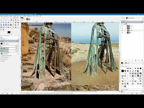
A statue with a sword, a foot and protrusions cannot simply be copied and distorted. This tutorial by video trainer Marco Kolditz shows you how to paint the shadow into the image yourself, piece by piece. It is the second part on the topic of drop shadows and covers the more elaborate method.
The video is only loaded from YouTube when you play it – data (including your IP address) is then transmitted to YouTube/Google. More in the privacy policy
Key Takeaways
Simple copies made with the Perspective tool only work for round or angular objects. For complex shapes, you have to paint the shadow by hand. To do this, work on a separate transparent layer below the object, use the original image as a guide, and paint beyond the edges. With blur, layer mask and opacity, you give the shadow a natural gradient. Finally, you adjust the colors of the object to match the background and place a noise layer over it.
Preparing the starting point and the reference
You start with two layers: the rock image is the background layer, and the cut-out statue lies above it. The original photo, in which the statue still stands in the light and casts its real shadow, goes at the very top of the layers palette. Show it when needed so that you can use it as a guide. Note that the ground in the original runs differently than in the background image, for example with elevations and cracks in the rock. You have to take these unevennesses into account when creating the shadow.

Why the copy method fails with this statue
The obvious approach would be to duplicate the statue, color the copy completely black, and drag it onto the rock with the Perspective tool. With a round mini golf ball or a cuboid, this works well. With the statue, however, it doesn't fit: the shadow of the sword lies where the foot's shadow should fall. You can adjust the distortion as often as you like, but you won't achieve a realistic result this way. So abandon this approach and delete the shadow copy again.

Creating your own shadow layer
Now create a new transparent layer and name it something like "Shadow". Drag it below the statue layer so that the shadow lies behind the object. Also zoom in on the image with the Zoom tool so that you can see both the area you are editing and the reference. Then select the Paintbrush tool. You don't paint with pure black, but with a very dark red tone. This looks more natural on the rock. You leave the opacity at 100 percent.

Brush settings and straight strokes
Use a hard brush and set the paint dynamics to "Dynamic" without size and opacity changes so that the strokes stay even. To paint straight lines, click at the starting point, hold down the Shift key, and click at the end point. You can adjust the size at any time. Make sure that the shadow layer is active before you get started.

Painting the rough shape of the shadow
Begin behind the statue and follow the course of the reference. Pay particular attention to the small crack in the rock, where the shadow doesn't simply continue straight but bends. You don't have to hit the shadow perfectly, because you can still adjust it later. Use the surface of the rock, which is uneven in some places, as a guide, and in this way paint the main shape of the shadow into the image.

Fine work with a smaller brush tip
For details, switch to a smaller brush tip. With it, you paint the areas where the shadow becomes narrower or the rock has a rise. Paint somewhat irregularly so that the shadow doesn't look like a smooth surface. For the unevennesses in the rock, it helps if you increase the brush size slightly in between.

Working out the shadow at the sword and foot
At the sword, you draw a straight line while holding the Shift key and then break it up a little at the rock surface. The foot is where it gets interesting: there should be a little shadow beneath the foot, even if it is barely visible. Paint the area up to the tip of the foot, reduce the brush tip size, and add small irregularities where the rock is uneven. You paint the narrow strips of shadow behind the sword with an even smaller brush.

Painting Beyond the Edge
An important point is that you must not end the shadow exactly at the contour of the statue. Always paint a little beyond the edge. When you blur later, the edge will be softened. If you had stopped right at the edge, individual spots along the edge would suddenly appear bright. Even in areas that drop off very deeply, it makes sense to apply only a little shadow, because hardly any shadow would be visible there.

Create a Backup and Work with the Blur Tool
Duplicate the shadow layer as a backup, name the copy something like "Shadow Backup" and hide it for now. On the original shadow layer, select the Blur tool. Set the convolve type to "Blur" and set the rate to about 60. Use a very soft brush and enlarge it significantly. The shadow should be sharpest where it begins and become softer toward the back. So go over the beginning of the shadow several times and then work your way back bit by bit. Reduce the brush size for the softer areas.

Soften the Contours of the Shadow and Statue
Now zoom in close to the contours. The edges often look too hard compared to the details in the background. Select the shadow layer and open Filters, Blur, Gaussian Blur. Set the radius to about one pixel. Then repeat the process for the statue layer. This way the shadow and object blend better into the background. Don't overdo it, because the original shows rather hard shadows.

Transparency Gradient with a Layer Mask
So that the shadow is darker near the object than in the distance, you work with a layer mask. Right-click the shadow layer, choose "Add Layer Mask" and confirm with "Add" with white. Activate the mask and select the Gradient tool. Set the foreground color to a medium gray and keep white as the background. Then drag out a linear gradient. Try out the length as you do. If you drag the gradient too short, the shadow stays almost equally dark everywhere. If you drag it too long, the shadow becomes too light at the back. Find the middle ground so that the shadow is darkest at the object and gradually becomes lighter toward the back.

Reduce the Opacity of the Shadow Layer
Reduce the opacity of the shadow layer to about 70 percent. The shadow then no longer looks so hard and fits the surroundings better. Compare the result using the before-and-after view to check the effect.

Adjust the Colors of the Statue to the Surroundings
To make the overall image look more harmonious, you adjust the colors of the statue. Duplicate the statue layer for safety, hide the copy and select the original layer. Open Color Balance via "Colors". There you can adjust shadows, midtones and highlights separately. For the shadows, move the slider slightly to the right so that it becomes more reddish and slightly more yellowish. The midtones also get a slight red tint, the highlights only very subtly. Keep an eye on the preview to see the effect directly. Then confirm with "OK".

Noise for a Natural Impression
Finally, you add a fine noise that connects the shadow and statue better with the photo. To do this, create a new layer above the statue, fill it with a medium gray and name it "Noise". Then choose Filters, Noise, HSV Noise. Set the value for Value to about 8 and set the values for Saturation and Hue as low as possible. The preview shows you whether the result fits. Then confirm with "OK".

Set the Layer Mode and Blur the Noise
So that the medium gray becomes transparent, switch the layer mode of the noise layer to "Soft Light". However, the individual pixels still look very hard. So select the noise layer, open Filters, Blur, Gaussian Blur and set one pixel. After that, the noise blends more evenly into the image. At the end, compare the result once more with the original image.

Conclusion: Two Ways to Create a Drop Shadow
In this tutorial, you learned two methods. The drop shadow filter is fast and works well when the light falls on the object from above. For complex objects and difficult lighting conditions, however, the manual method with a separate shadow layer is worthwhile. You can also take more time with the shadow areas at the base of the statue and darken them even further. This leads to an even more realistic result.

Summary ??? Manually Creating a GIMP Drop Shadow for Complex Objects
You learned why complex objects cannot be represented by copying and distorting a layer. Instead, you paint the shadow on a separate layer following the template, work with brush strokes that extend beyond the edge, and give the shadow a realistic gradient using blur, layer mask, and opacity. Finally, you adjust the colors of the statue and add some noise. This way, you convincingly integrate the object and shadow into the background image.
FAQ
Why doesn't the perspective tool work for the statue?The statue consists of parts that are at different distances from the ground. A simple distortion of the shadow copy therefore cannot realistically represent the shadow of the foot and the sword.
Why do I paint the shadow beyond the edge of the statue?When blurring later, the edge of the shadow is softened. If the shadow ends exactly at the contour, individual spots at the edge become light again.
Which brush type is suitable for painting the shadow?A hard brush is suitable for the main shape, and the paint dynamics should be set to "Dynamic" without size and opacity changes. For details, you use a smaller brush tip.
How do I draw straight lines with the brush?Click at the starting point, hold down the Shift key, and click at the end point. This creates a straight line.
What is the layer mask used for with the shadow?With the layer mask and a linear gradient in gray, you make the shadow darker close to the object and lighter toward the back.
Why should I duplicate the shadow layer?The copy serves as a backup in case you make a mistake while blurring or adjusting.
Which layer mode is used for the noise layer?You set the mode to "Soft Light". This makes the mid-gray transparent and only the noise remains visible.


