
Curved lettering that follows a line often looks elaborately designed on posters and in graphics. In GIMP, however, there is a manageable technique behind it: you first draw a path and then let the text run along it. In this tutorial, you will learn how to create a path, align text to it, adjust the font to your liking, and permanently place the result on its own layer. The tutorial builds on the basics of placing text. If you are not yet confident using the Paths tool, watch the corresponding video in the chapter on the toolbar beforehand.
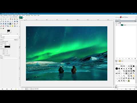
The video is only loaded from YouTube when you play it – data (including your IP address) is then transmitted to YouTube/Google. More in the privacy policy
Key Takeaways
The text always starts at the first anchor point of the path. Once created, text on a path can no longer be edited directly, so you should keep the original text layer until the end. With the "Selection from Path" option and a transparent layer, you make the text on the path visible. With "Autocrop Layer", the finished text can then be moved conveniently.
Step-by-Step Guide
Step 1: Create the path
Before you can align text to a path, you need the path itself. To do this, select the Paths tool. Think beforehand about where the text should run, for example along a horizon, a mountain range, or, as in this example, along a curved shape made of polar lights. With a click of the left mouse button, set the individual anchor points and drag the line so that it matches your idea. For the demonstration, the path does not have to be perfect. What matters is that you can refine it at any time later.

Step 2: Set anchor points and define the course
Set more anchor points until the path has the desired shape. Pay attention to one point that will prove decisive later: the text to be placed always starts at the first anchor point. A short text will therefore end after just a small part of the path, while a longer text extends over the entire course. Plan the length and shape of the path depending on your text. The newly created path remains editable in any case and is saved in the Paths palette.

Step 3: Manage the path in the Paths palette
The paths are displayed in their own palette. An unnamed path appears there automatically as soon as you have created it. If you switch to the Move tool, the path is initially hidden. Don't worry: you can show it again at any time via the eye icon in the Paths palette. With the Paths tool, you can continue to edit it after showing it. Then hide the path again so that it doesn't get in your way when writing the text. Then switch to the Layers palette. There you will see that so far only the background image exists as a layer.

Step 4: Enter the text
Select the Text tool and click once in the image. You can then enter your text. In this example, it reads "wunderschöne Polarlichter". The text usually appears quite small at first, which is normal in practice. Therefore, adjust it directly in the tool options. You can change the font size, choose a different font, and increase the letter spacing so that the lettering looks airier. You don't have to set the color at this point, since it will be replaced later anyway.

Step 5: Fine-tune font, size, and letter spacing
When designing, it helps to look at the length of the path. Look at the path again and compare it with your text. If the text is shorter than the path, you can increase the font size step by step until the two match. In the example, the size was first set to 80, then to 90, and finally to 110. Feel free to try several values and check each time whether the text still fits the path completely. If you want to assess text and path at the same time, show the path in between.

Step 6: Bind the text to the path
Hide the path again and make sure the text layer is active. Then right-click on the text and select the "Text along Path" entry. The text is now arranged along the previously created path. A new text path appears in the Paths palette. However, this is no longer editable. If you want to change the text, you must go back to the original text layer and create a new text path.

Step 7: Preserve the original text layer
You should not delete the original text layer at this stage. Simply hide it using the eye icon. Often you only realize later that you want to change something in the text, and then you have the original layer as a starting point. Hiding it also prevents two versions of the text from overlapping.
Step 8: Create a transparent layer for the path text
To make the path text visible, you need a new layer. In the Layers palette, click the icon for new layers. Give it a meaningful name, for example "Text", and choose "Transparency" as the layer fill type. Then confirm with "OK". The layer is now empty and transparent, so you can place your path text on it without covering the background image.

Step 9: Load the path text as a selection
Switch to the Paths palette and right-click on the path text. Select "Path to Selection" there. A selection appears, which you can recognize by the familiar marching ants. Now hide the path and switch back to the Layers palette. Make sure you are on the transparent text layer before you continue.

Step 10: Fill the selection with color
You can fill the selection in various ways, for example with a gradient. For this tutorial, the text is shown in pure white. To do this, with the selection active, choose the entry "Fill with BG Color" in the "Edit" menu. Since the background color in this example is white, the text immediately appears in this color. Afterwards, remove the selection via "Select" and "None" so that the marching ants disappear.

Step 11: Readjust the position of the text
If you want to place the text in a different spot, switch to the Move tool. In the tool options, activate the option "Pick a layer or guide" and click on a white area of the text. When moving, you will notice that the layer is as large as the entire document. This makes moving unnecessarily sluggish. Therefore, with the text layer active, choose the entry "Autocrop Layer" in the "Layer" menu. The layer shrinks to the size of the text, and moving runs much more smoothly.

If you want to edit the text again later, simply show the text layer again. You can continue to edit the original text and create a new path text from it at any time.
Summary – GIMP Aligning Text to a Path: Step-by-Step Guide
You have seen how to create a path in GIMP, enter text, and bind it to this line via "Text along Path". The text begins at the first anchor point, and the font can be adjusted beforehand in size, type, and letter spacing. The path text itself is no longer editable, which is why you keep the original text layer. Using a transparent layer, the selection from the path, and filling with color, you make the text visible. With "Autocrop Layer" you can then conveniently position it on your image.
FAQ
Does the path have to be created before the text?Yes, the path must exist before you can align the text to it. However, you can still refine it later using the Path tool.
Where does the text begin on the path?The text always begins at the first anchor point of the path. A short text therefore ends sooner, while a longer text runs along the entire course.
Can I change a path text afterwards?No, the path text is no longer editable. You make changes to the original text layer and then create a new path text.
Why should I not delete the original text layer?Often you only realize later that you want to change something in the text. Without the original layer, you would have to re-enter and re-format the text.
What is the transparent layer for?The path text is placed on a transparent layer without covering the background image. This way you can position the text freely.
What does "Autocrop Layer" do?The layer is reduced to the size of the text. This allows the text to be moved more smoothly, because the entire document is no longer being moved along as a layer.


