
Even a small color cast often makes a photo look artificial: shadows that are too blue, pale skin tones, or a flat mood. This is exactly where the color tools in GIMP come in. In this tutorial, you will get to know the first four of them: Color Balance, Hue/Saturation, Colorize, and Brightness/Contrast. The guide is based on the first part of the video tutorial by Marco Kolditz and takes you from showing the tools to saving your own presets. All you need is an open image in GIMP.
The video is only loaded from YouTube when you play it – data (including your IP address) is then transmitted to YouTube/Google. More in the privacy policy
Key Takeaways
- The color tools are hidden in the toolbox by default. You can show them via Edit › Preferences or open them directly via the Colors menu.
- Always work on a copy of the layer, because the color tools permanently change the pixels.
- Move the sliders carefully. Even strong adjustments lead to color banding and unnatural tones.
- You save your own presets via the plus sign, and with the export icon you save them to a file.
- Brightness/Contrast is a simple tool; for most images there are better alternatives.
Step-by-Step Guide
Step 1: Show the color tools in the toolbox
In the Edit menu, open Preferences and select Toolbox on the left. There you will see a long list of all tools. An eye icon indicates that a tool is visible in the toolbox. Clicking the icon hides it, and clicking the empty area next to it shows it again. Scroll all the way down, where you will find the color tools in a hidden state. Click the empty area next to Color Balance and then confirm with OK. The tool now appears permanently in the toolbox.

Step 2: Open the color tools via the Colors menu
You don't necessarily have to have the tools in the toolbox. In the Tools menu, you will find all the color tools under the item Colors. It's even faster via the Colors menu in the top menu bar, since they are listed there as well. This option is especially suitable if you don't want to permanently change the tool list.

Step 3: Create a copy of the layer
Before you change colors, you should duplicate the image layer. The color tools work destructively, meaning the original pixels are overwritten. In the Layers palette, click the image layer and then click the icon for duplicating the layer at the bottom. The copy appears above the original, and you continue working with exactly this copy. That way you can return to the unchanged image at any time.

Step 4: Apply Color Balance to shadows, midtones, or highlights
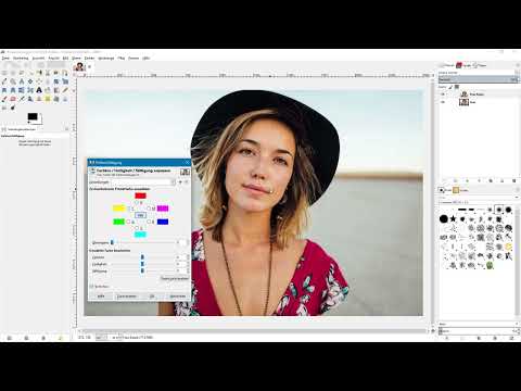
Select Color Balance via Colors. In the dialog box, you first decide which tonal range is edited: the shadows (dark areas), the midtones, or the highlights. For example, activate the shadows if you want to specifically influence the dark parts of a portrait. With the sliders at the bottom, you then shift the color components. An example: To make the hair in the shadows look slightly blue, you drag the top slider a bit toward Cyan and the bottom slider toward Blue.

Step 5: Compare the result using the preview
Activate the preview at the bottom of the dialog to see the state of your image with the current settings. If you deactivate the preview, the program shows the image in its original state again. You should use this switch frequently, because it's the only way to reliably judge whether the color looks natural or not.
Step 6: Dose carefully to avoid color banding
With the Color Balance sliders, the rule is: subtle is better. If you push the top slider too far to the left, unnatural colors and harsh color transitions quickly appear, which are especially noticeable in hair and at edges. Therefore, move the sliders in small steps and check the result repeatedly in the preview. Better two small corrections than one big one that stands out disturbingly later.

Step 7: Save, reset, and export your own presets
With a click on the plus sign, you save your settings as a preset. Assign a meaningful name, such as Blue Shadows, and confirm with OK. The preset then appears in the Settings selection menu. With the Reset button, you bring all sliders back to zero, and by selecting the saved preset, you restore the values immediately. Via the small arrow icon, you can also export the settings to a file and import them again later, for example after a fresh installation of GIMP.

Step 8: Discard the Color Balance
If you do not want to apply the changes to the layer, click Cancel. The dialog box closes, and the layer remains unchanged. This is especially useful if you just want to try out how a tool reacts.
Step 9: Adjust Hue and Lightness with Hue/Saturation
In the Colors menu, select the entry Hue/Saturation. The Hue slider changes the hues in the entire image. If you move it slightly to the right, all colors shift visibly, and the same happens when you move it to the left. The button in the middle of the dialog stands for all colors. You can adjust the lightness here as well, but GIMP offers significantly better functions for a clean brightness correction. With Reset Color, you restore the default values.

Step 10: Reduce the Saturation Down to a Black-and-White Image
The Saturation slider determines how strong the colors in the image appear. If you slide it all the way to the left, all color disappears, and the image becomes black and white. Afterwards, reset the values to the defaults with Reset Color.

Step 11: Edit Only a Specific Color Range
In the dialog, you can also select individual color ranges, such as the reds, magentas, or blues. Activate the red range and drag the Saturation slider all the way to the left. Then only the red areas in the image are desaturated, while all other colors are preserved. This targeted editing is suitable, for example, for toning down a distracting red jacket in the background.

Step 12: Smooth Color Breaks with the Overlap Slider
When desaturating individual color ranges, hard edges quickly appear, for example between colored and black-and-white areas in the hair. The Overlap slider controls how soft the transition is between the affected and unaffected area. If you move it a bit to the right, the transitions become smoother and look more pleasing overall. In most cases, it is advisable to shift this slider slightly to the right by default.

Step 13: Create a Color Mood with the Colorize Tool
Under Colors, select the entry Colorize. The tool first converts your image into a black-and-white image and then tints it with a chosen color. You determine this color with the Hue slider. If you move it to the right, the image becomes bluish or violet; if you move it to the left, warm tones appear. A value to the left of the center is well suited, for example, to give a photo a sepia look.

Step 14: Adjust the Saturation and Lightness of the Colorization
With the Saturation slider, you control the intensity of the color. If you increase the value strongly, the image quickly looks like an exaggerated neon look that appears very unnatural. If you drag the slider to the left, the color becomes more subtle. With the Lightness slider, you can brighten or darken the entire image. A value of about 10 gently brightens the shadows in the example. For a precise brightness correction, however, other tools are better suited. If you confirm with OK, the changes are applied to the layer. With the plus sign, you additionally save the settings as a preset in order to apply them to other images later.

Step 15: Use the Brightness/Contrast Tool
You open the Brightness/Contrast tool via the Colors menu. It has two sliders. If you move the Brightness to the right, the image becomes brighter but at the same time looks somewhat flatter. If you drag the slider to the left, the image becomes darker overall. This function is very simple in design, but you should still use it with caution.

Step 16: Change the contrast carefully
The contrast slider increases or decreases the differences between light and dark areas. A greatly increased contrast also slightly increases the saturation in the image. If you move the slider to the left, the image loses contrast and looks flat. In practice, for contrast and brightness corrections you are better off using tools such as the Curves or layer editing, which work more precisely. Brightness/Contrast is mainly suited for quick, rough adjustments.

Summary – GIMP Color Tools: Color Balance, Hue/Saturation, Colorize and Brightness/Contrast
You have now gotten to know the first four color tools in GIMP. After enabling them, you can find them in the toolbox or directly in the Colors menu. It is very important that you always work on a copy of the layer, since the changes are permanent. With Color Balance you specifically control shadows, midtones and highlights, Hue/Saturation allows global or color-specific corrections, and Colorize gives the image a complete color mood. Brightness/Contrast is mainly suited for quick basic corrections. With the preview, subtle slider movements and saved presets, you work cleanly and can transfer your settings to other images at any time.
FAQ
How do I show the color tools in the GIMP toolbox?Open Edit, then Preferences, select Toolbox, scroll down and click on the empty space next to the eye icon for the desired color tool, then click OK.
How do I find the color tools without changing the toolbox?You can find them in the Tools menu under Color Tools or directly in the main menu Colors.
Why should I duplicate the layer before editing?The color tools work destructively, meaning they change the pixels permanently. With a copy you keep the original.
What does the preview in Color Balance do?It shows you the image with the current settings, and when deactivated it shows the original state, so that you can compare both.
How do I prevent color banding in Color Balance?Move the sliders only in small steps and check the result regularly in the preview.
How do I save my settings for later?Click the plus sign in the dialog, assign a name and confirm with OK. Using the arrow icon, you can additionally export the preset as a file.
How do I convert an image to black and white with Hue/Saturation?Drag the Saturation slider all the way to the left, after which the image is completely desaturated.
How do I change only the red tones of an image?In the Hue/Saturation dialog, select the red range and adjust the saturation. With the Overlap slider you make the transitions softer.
How do I create a sepia look?Use the Colorize tool and move the Hue slider to the left to get warm tones. You should keep the saturation subtle.
Is Brightness/Contrast a good tool for image correction?It is suitable for quick basic corrections. For more precise results, other tools in GIMP are better suited.


