
Your project is set up and all the components are assembled. Now it's about the fine adjustments that turn a good composition into a coherent picture. In this section, an experienced instructor shows you how to refine the atmosphere of your shot with color correction using curves and a subtle glow effect.
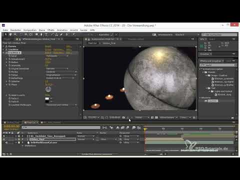
The video is only loaded from YouTube when you play it – data (including your IP address) is then transmitted to YouTube/Google. More in the privacy policy
Introduction
The final touch consists of two building blocks: a fine color correction and a light glow. You have already partially prepared both, but only the final adjustment brings out the golden tones of the globe properly. You mainly work with curves, because they cover the entire tonal range and can therefore be used to create almost any desired color mood. Afterwards, you use the glow effect to add targeted highlights that make the image look lively.
Key Takeaways
- Curves are the central tool for color correction because you can precisely control all channels and tonal ranges.
- Blue in the shadows creates contrast with the warm golden tones, but should be dosed subtly.
- The glow effect works best when you coordinate threshold, radius, and opacity.
- A low opacity of around 0.1 to 0.3 usually delivers the desired effect without overdoing it.
- You have to set the values anew for each shot, because every image reacts differently.
Step-by-Step Guide
Step 1: Use curves as the basis for color correction
Start with the curves, because they give you the greatest control over your image. Open the effect and work your way through the individual channels. Curves allow you to adjust each tonal range separately, and that's exactly what makes them your favorite tool for fine-tuning. It's important that you first have a clear goal in mind: What mood should the shot ultimately convey?

Step 2: Raise blue in the shadows
In the next step, you slightly raise the shadows so that the image doesn't sink into pure black. To do this, set a point in the lower area of the curve and carefully pull it upward. Additionally, you can raise the shadows in the blue channel a bit more. At the same time, you raise all channels minimally, so that the image as a whole gets a somewhat flatter but harmonious look.

Step 3: Use the blue in a measured way
Be restrained with the blue level. Too much blue quickly looks unnatural and disturbs the interplay with the warm golden tones of the globe. First work the shadows strongly to see the effect, and then reduce the blue significantly. A slightly bluish shadow that is barely noticeable in the midtones and highlights creates the best contrast.

Step 4: Balance midtones and highlights
Raise the curve slightly in the lower area and remove the blue from the midtones so that the globe doesn't look cold. A small amount of blue may remain in the highlights, but the midtones should stay free of it. In addition, you bring out some contrast with the general curve. Keep in mind: A flat image without true black can still be high in contrast, as long as the brightness distribution is right.

Step 5: Use a black-and-white comparison for checking
Switch the effect to a black-and-white view in between. This way you can quickly see whether the brightness distribution is right, regardless of color. If the black-and-white image already looks coherent, you're on the right track with the basic structure. The color then only complements this foundation.

Step 6: Find and activate the glow effect
Now the glow effect comes into play. Search for "Glow" in the Effects panel and drag the effect onto your layer. You'll find it in the "Stylize" category. Make sure you apply the effect to the right layer, because only there do the highlights take effect in a targeted way.

Step 7: Limiting the Glow to Hot Areas
A glow should not overexpose the entire image. Therefore, set the threshold so that only the truly bright spots are affected, such as individual areas of the globe. Set the radius to about 20 so that the light blends softly. Reduce the intensity significantly, for example to 0.2 to 0.3. This creates small highlights that come and go in the moving image and therefore look very lively.

Step 8: Duplicating the Glow Effect and Using It More Globally
Duplicate the Glow effect to build up a second layer. For control, first set the intensity to 1 so you can see what is happening. Then lower the threshold considerably so that other parts of the globe also begin to glow. Also increase the radius to achieve a softer, slightly dreamy look. Afterwards, reduce the opacity to about 0.2 so that the effect stays subtle.

Step 9: Assessing the Color Effect of the Glow
Take a look at how the glow affects the color impression. It expands the color spectrum because more areas of the image are covered. A rich orange tone, a yellow tone, and a slightly reddish green together make a really beautiful gold tone. This gold tone comes across especially well thanks to the glow. Keep in mind that glow intensities such as 0.2 can make a big difference.

Step 10: Fine-Tuning the Second Shot
The second shot also needs some fine-tuning. Use a curve here as well and raise the shadows very slightly so that the two shots match visually. Add a bit of blue to the shadows, but take it back out in the midtones. Additionally, add a little red, because green dominates in this shot. This provides more warmth, which fits the overall mood well.

Step 11: Emphasizing the Brightest Areas with a Fine Glow
Apply another glow to the second shot that specifically emphasizes the very brightest areas. Here you work with a small radius and a very low intensity, around 0.1 or less. A fine sheen on the peaks is enough. Check the effect by briefly setting it to full intensity, and then reduce it again afterwards.

Step 12: Comparing Before and After
Compare the state before and after the glow. Even if the difference seems small at first, the color shift changes the image noticeably. A neutral area becomes a golden orange. This direct comparison shows you whether the effect really holds up or merely attracts attention.

Step 13: A Second Glow for the Golden Touch
Apply a second glow with a larger radius to the larger areas of the image. The opacity is around 0.05 so that the effect is barely visible but still effective. Increase the threshold slightly so that the glow remains limited to certain areas. This creates the golden touch that gives the overall image its decisive note.

Step 14: Checking the Overall Result With and Without Grading
Finally, switch the grading on and off to check the difference. The version with grading looks more coherent because all the elements fit together. A small amount of color correction and atmosphere makes the difference between a finished project and one that was simply completed.

Summary ??? Final Touch in After Effects: Grading and Glow for Your 3D Project
You have learned how to shape the color mood of your shot with curves, use blue in moderation in the shadows, and set targeted highlights with the Glow effect. The interplay of the values is crucial: threshold, radius, and opacity must suit the respective image. With this approach, you get a golden touch that rounds off the entire project. If you like, you can then apply the techniques to your own projects and try out the values anew for each shot.
FAQ
Why are curves so important for color correction?Curves cover the entire tonal range and allow you to control each color channel precisely. This lets you create almost any desired mood.
How much blue should I add to the shadows?Only enough so that the image doesn't become pure black and forms a slight contrast with the warm tones. Too much blue quickly looks unnatural.
Why should I check the effect in black and white from time to time?That way you can see whether the brightness distribution is right without being distracted by the color.
Where do I find the Glow effect in After Effects?You search for "Glow" in the Effects panel. It is located in the "Stylize" category.
Which values are suitable for a subtle glow?A strength of about 0.2 to 0.3 and a radius of around 20 are good starting values. For very fine highlights, 0.1 or less is often enough.
Do I have to readjust the values for every shot?Yes, every image reacts differently. The values serve as a guide and should always be checked against the respective shot.
Why do you duplicate the Glow effect?A second layer with a different threshold and a larger radius creates a softer, dreamy look and expands the color spectrum.
What is the benefit of comparing with and without grading?You can see whether the color correction and the glow really improve the image or whether you are applying effects without clear added value.


