
Imagine an old cassette recorder where only one key can be pressed at a time. This is exactly the principle behind the radio button in JavaFX. If you are building a user interface in which the user should choose exactly one option from several, the RadioButton is the right control.
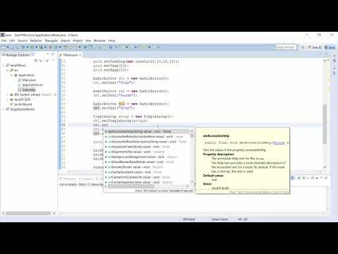
The video is only loaded from YouTube when you play it – data (including your IP address) is then transmitted to YouTube/Google. More in the privacy policy
In this tutorial, you build three radio buttons (Play, Pause and Stop) step by step, group them, define a default selection and make sure an image changes automatically with each selection. All you need is knowledge from the previous lessons on GridPane, buttons and listeners.
Key Takeaways
- A RadioButton is a selection element in which only one option can be active at a time.
- A ToggleGroup ensures that only one button within the group is selected at any time.
- With
setSelected(true)you define which button is preselected at startup. - With
setUserDatayou store additional information, for example file names, which you evaluate later. - A ChangeListener on the
selectedTogglePropertyof the ToggleGroup reacts to every change of the selection.
Step-by-Step Guide
Step 1: Create the First RadioButton
Start with an empty basic framework that contains a GridPane. Then create your first radio button with new RadioButton(). The button is passed a text right away, in this case "Play". The text is displayed in the program next to the round circle. Make sure that the spelling of the class is exactly RadioButton, because Java is case-sensitive.

Step 2: Add the RadioButton to the GridPane
Now you add the button to the GridPane. This is done via gridPane.getChildren().add(rb1). So that the element also appears at a specific location, you define the position with GridPane.setConstraints. Pass the column and the row. With the values 0 and 0, the button ends up at the top left. You can already activate and deactivate the button now, but it does not yet belong to any group, which is why the selection does not yet mutually exclude each other when there are several buttons.
Step 3: Create More RadioButtons
You create the other two buttons in the same way. The second gets the text "Pause", the third the text "Stop". Make sure to give each button its own variable, for example rb2 and rb3. If you place all buttons at position 0/0, they overlap, and you only see the text that was drawn last. This is not an error in the code, but a consequence of the identical positions.
Step 4: Create a ToggleGroup
So that the radio buttons mutually exclude each other, you need a ToggleGroup. Create it with new ToggleGroup(). If the import is missing, the IDE usually takes care of this step via the key combination Ctrl + Shift + O or Cmd + Shift + O on the Mac. The ToggleGroup is basically just a container that manages the selection.
Step 5: Add the Buttons to the Group
Now you connect the buttons to the group. To do this, you call the method setToggleGroup(group) on each RadioButton. Go through all three buttons and pass the same group each time. Only then does everything behave as desired: if you select a button, the previously active one is automatically deselected.

Step 6: Correct the Positions
So that the buttons no longer lie on top of each other, you distribute them across different rows. The first button stays at row 0, the second gets row 1 and the third row 2. The adjustment is again done via GridPane.setConstraints. After this change, the three options are arranged one below the other, and the texts are fully legible.

Step 7: Define a Default Selection
Often an option should already be active at startup. A call to rb1.setSelected(true) is enough for this. The term selected means "chosen" or "selected". If you set the value to true, the Play button is active when the program starts. Thanks to the ToggleGroup, the other buttons are automatically deselected.

Step 8: Integrating an ImageView with Images
In the next step, an image should change to match the selection. To do this, you first create an ImageView object. Then you load an Image, namely via getClass().getResourceAsStream("play.jpg"). This call reads the file from the resources of your application. Therefore, copy the three image files for Play, Pause, and Stop into the appropriate resources folder of your project. The file names must match the specifications in the code exactly, otherwise you will get an error when loading.


Step 9: Binding the UserData to the Buttons
You don't have to hard-wire the image names in the code. It is more elegant to attach them to the buttons. To do this, you use setUserData, for example rb1.setUserData("play.jpg"). Do the same with the other two buttons. In the listener, you can later use getSelectedToggle().getUserData().toString() to read out the name of the currently selected button and determine from it the file name for the matching image.

Step 10: Setting the Image at Startup and Creating a ChangeListener
So that the correct image appears at startup, you set the image before the listener with imageView.setImage(image). Then you register a listener on the selectedToggleProperty of the ToggleGroup. Use addListener and a ChangeListener for this. Inside the listener, the new image is loaded each time the selection changes. This is where the actual logic lies: The listener gets the active button, reads its UserData, and replaces the image in the ImageView.


Step 11: Adding the ImageView to the Layout
Next, you add the ImageView to the GridPane, likewise with getChildren().add() and setConstraints. It should be in the first column, but appear larger than the buttons. To do this, you set the value of GridPane.setRowSpan to 5. As a result, the image occupies five rows, and the radio buttons sit beside it. You can then adjust the size more precisely using setFitWidth and setFitHeight.


Step 12: Testing the Result
Start the program and click the radio buttons one after another. The image changes with each selection, and only one button remains active at a time. In this way, you have built an interface with little code in which the selection controls which image is displayed. The same logic can later be applied to other content, such as text fields or status messages.

Summary ??? JavaFX Radio Buttons with Groups and Image Switching
You have learned how to create RadioButtons, add them to the GridPane, and combine them in a ToggleGroup. With setSelected(true) you define a preselection, and with setUserData you store additional information. The ChangeListener on the selectedToggleProperty reacts to every change and swaps the image in the ImageView. This combination of selection, data binding, and listener is a pattern you will encounter again in many interfaces.
The next video is about checkboxes, which, in contrast to radio buttons, allow multiple options at the same time.
FAQ
Can I use multiple RadioButtons without a ToggleGroup?Yes, that is technically possible, but then the buttons do not mutually exclude each other. Each button can be selected and deselected independently. For a true selection from several options, you therefore always need a ToggleGroup.
What is setUserData used for with RadioButtons?With setUserData you can attach any value to each button, for example a file name or an ID. In the listener, you read this value via getSelectedToggle().getUserData() and process it further, without having to distinguish the button itself.
What happens if I apply setSelected(true) to two buttons of the same group?The ToggleGroup ensures that only the button set last remains active. The other one is automatically deselected. Nevertheless, you should only define the preselection once so that the code stays clear.
Why is the image not displayed even though the code looks error-free?Often it is due to the path or the file name. getResourceAsStream searches in the resources folder of your project, and the spelling must match exactly, including upper and lower case. Also check whether the image files are actually in the correct directory.


