Would you like to learn how to implement a Button in a WPF application that responds to events and provides some interesting visual effects? In this guide, you will understand step by step how to create both a textbox and a button in WPF, and how to use the Click event of the button to achieve specific behavior in your application. Additionally, we will explain Dependency Properties that allow you to dynamically adjust the user interface to user interactions.
Main Insights
- You will learn the basics of the Button Click event in WPF.
- You will discover how Dependency Properties are used to make dynamic changes to the user interface.
- You will see how to create a textbox and modify it using a button.
Step-by-step Guide
Create Textbox
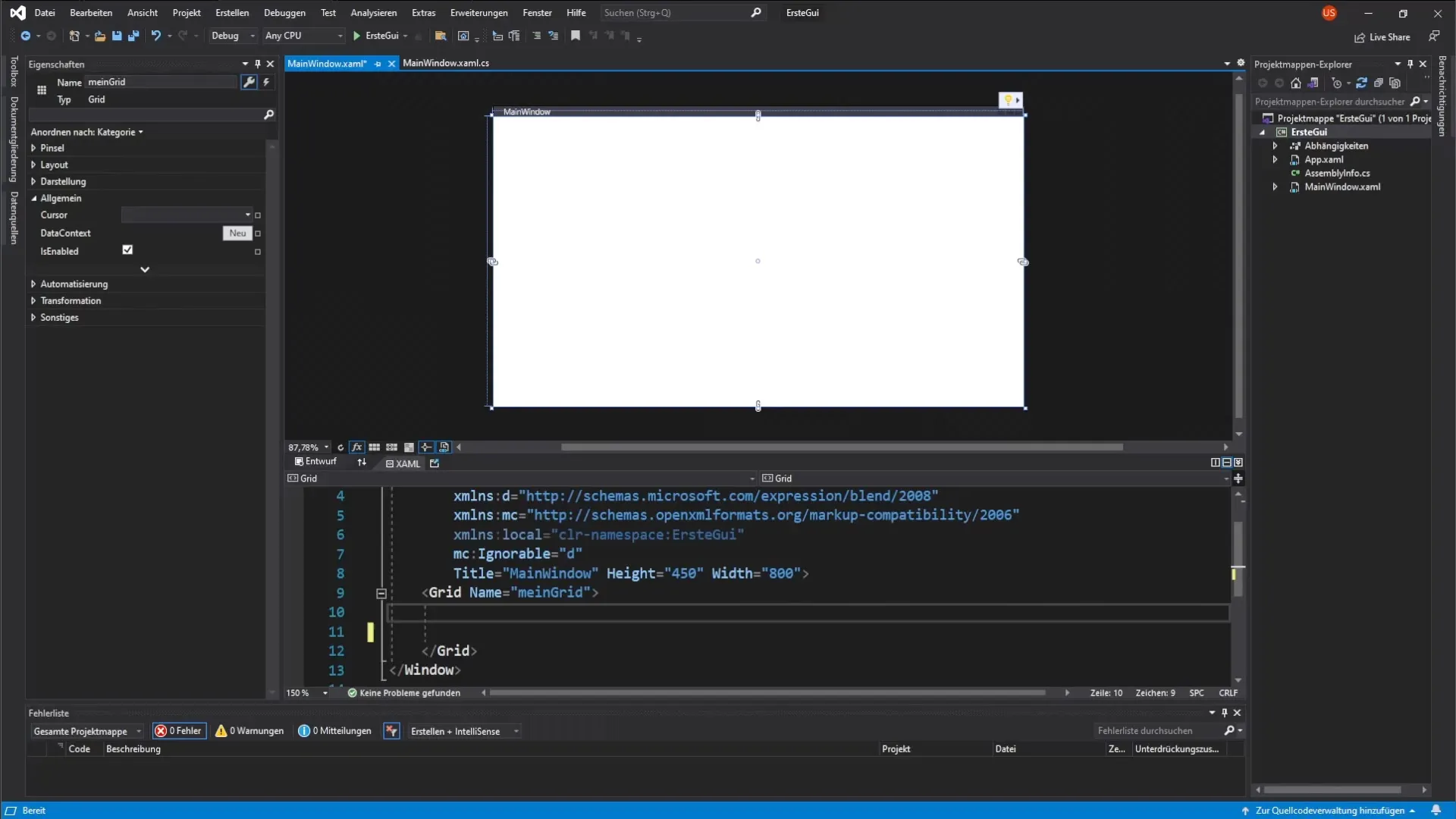
Start by creating a textbox in your WPF application. We want the user to later see text here that is generated by clicking the button.
Create a new textbox and name it "my Textbox". Set the font size to 14. To make your textbox look good, ensure that it provides enough space.
Add Button
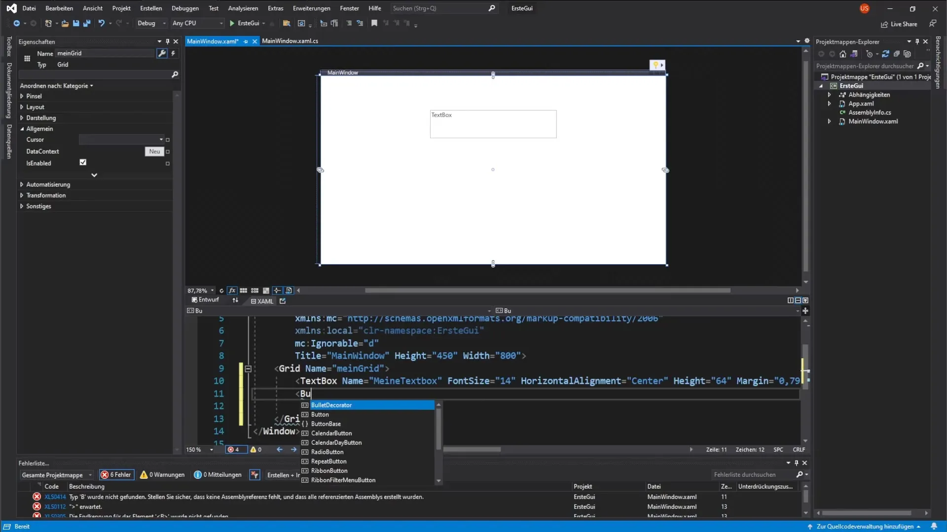
Now it’s time to add a button. The button will be used to generate a click event. You can do this by writing the corresponding XAML code.
Introduce a small tag pair that defines the button. Give the button the name "my Button". Also, set the width to 200 and the height to 100 pixels.
Define Button Properties
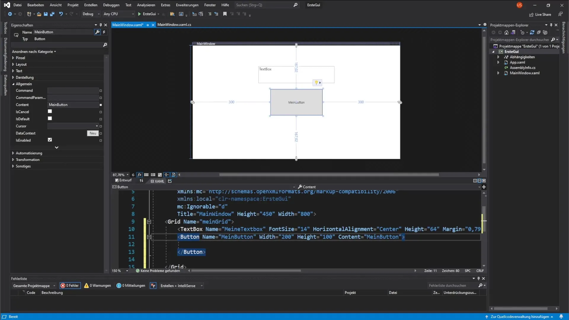
After creating the button, you will give it some properties. Set the text of the button using the Content property to "my Button". Additionally, add a background color – in this case, gray.
Setup Mouse Reaction
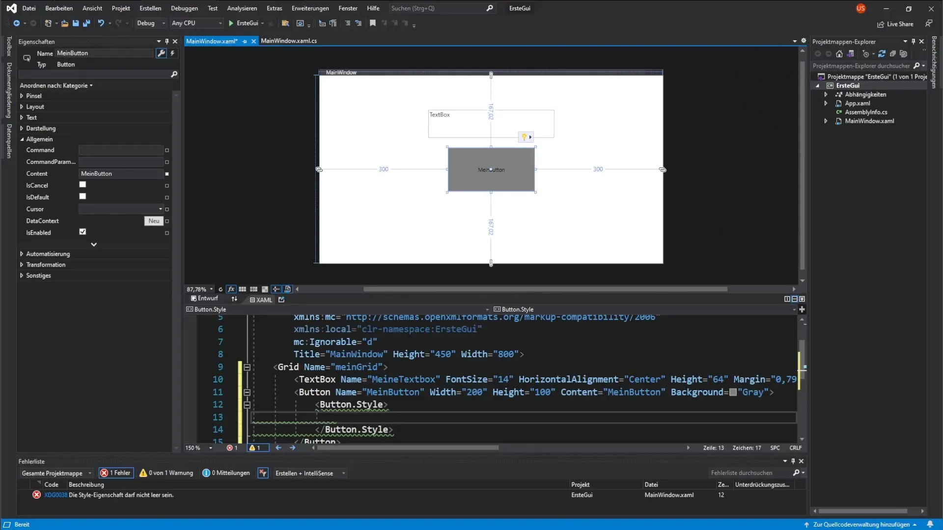
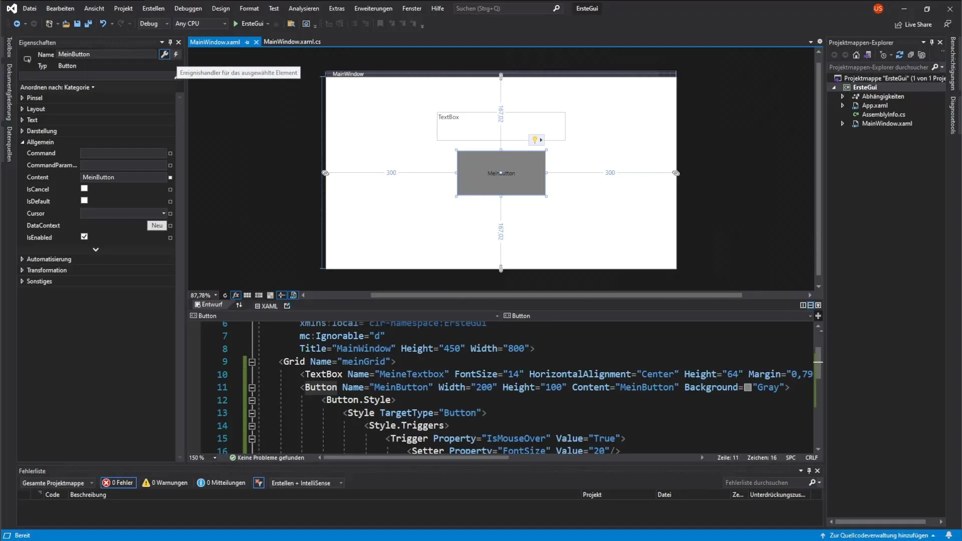
Now you want the button's properties to change when the user hovers over it with the mouse. For this, we will use the MouseOver event. You will define a button style and add a trigger that reacts to the MouseOver event.
The button style defines the visualization of the button, and the triggers allow you to change properties like the font size and background color dynamically.
Implement Click Event
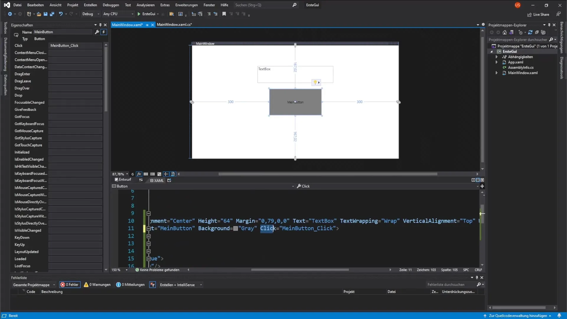
Now we want to capture the button's click event to change the text in the textbox when the button is clicked. You have the option to do this either directly in the XAML code or in the properties window of the button.
To add the event, click on the lightning bolt icon in the properties window of the button and select the Click event.
Events in Code Behind
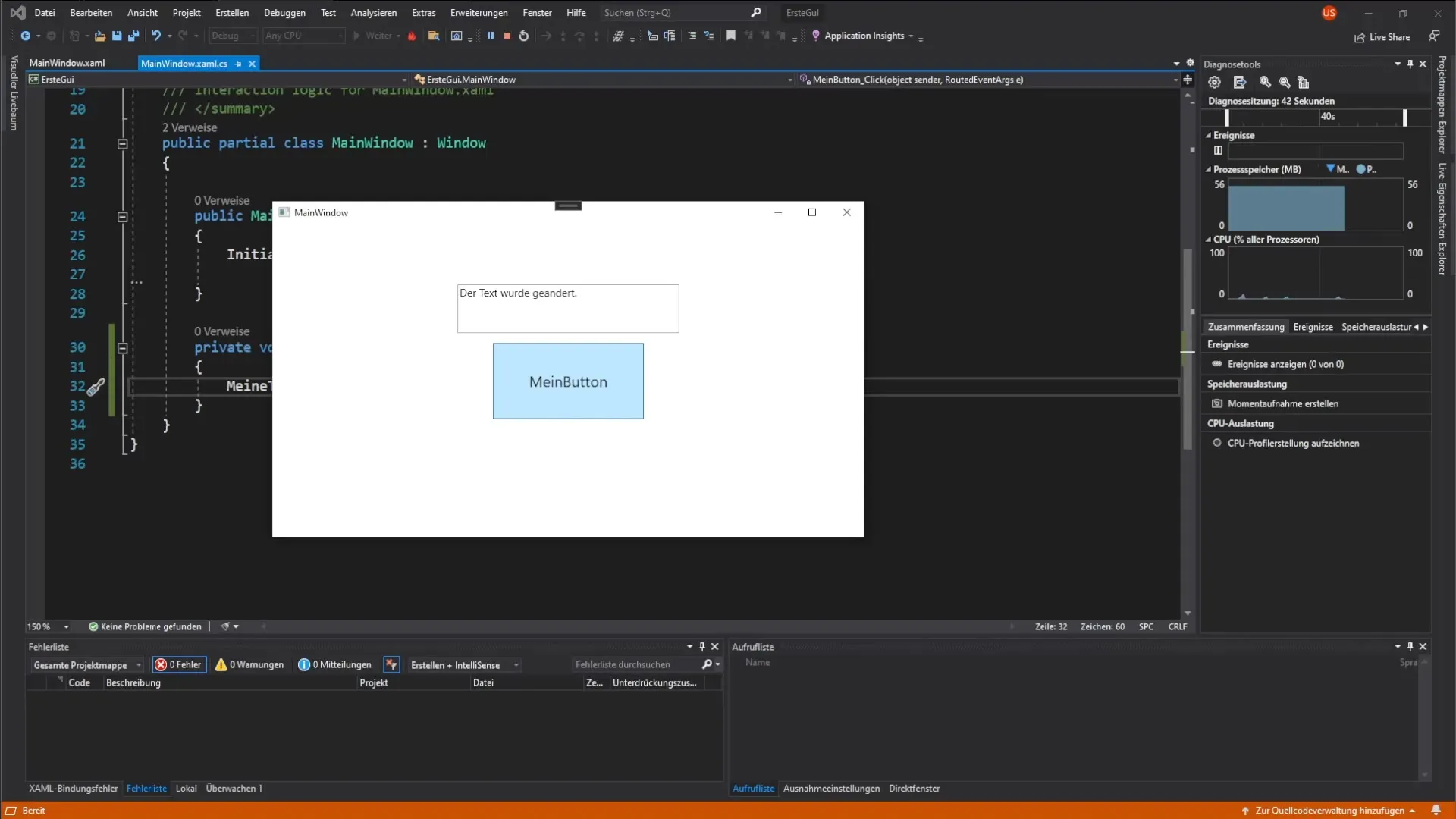
A double click on the Click event takes you to the code-behind where you can add the logic. You want to change the text of the textbox, which you achieve by accessing the textbox and changing the text with an appropriate assignment.
Test Functionality
After going through all the steps, it’s time to test the result. Start your application and see if the textbox displays the correct text when you click the button. Also test the MouseOver effects to ensure they work as expected.
Summary – Guide to Implementing a Button in WPF with Click Event and Dependency Properties
In this guide, you learned how to create a button and a textbox in WPF, and how to respond to various events. You understood the application of Dependency Properties and saw how to make an application interactive. Your user interface now responds to user inputs and offers a dynamic experience.
Frequently Asked Questions
What are Dependency Properties?Dependency Properties are properties that allow WPF to obtain their values from different sources and can change dynamically.
How can I customize the Click event of the button?You can add the Click event in the code-behind where you define the desired functionality.
Can I add more properties to the button?Yes, you can add many other properties to style the appearance and behavior of the button.
What other behaviors can I implement with MouseOver?Besides color changes, you can change the font size, border, and many other visual attributes.
