
Warm highlights on the skin and cool, blue shadows in the background: You create this look with the Split Toning adjustment layer in Affinity Photo. It divides your image into highlights and shadows and lets you tint both areas independently of each other. In this tutorial, you'll learn what the function is for and how to use it step by step.
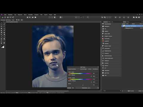
The video is only loaded from YouTube when you play it – data (including your IP address) is then transmitted to YouTube/Google. More in the privacy policy
Key Takeaways
- Split Toning breaks your image down into highlights and shadows, which you tint separately.
- A chosen hue has no effect as long as the saturation is set to 0%.
- The balance determines which hue is more strongly represented in the overall image.
- Warm highlights combined with cool shadows create an exciting contrast.
- With the saturations and the opacity of the layer, you can dose the effect subtly or strongly.
Step-by-Step Guide
Step 1: Open the sample image and create an adjustment layer
First, open your photo in Affinity Photo. It is present as a background layer and forms the foundation for all further steps. Then create a new adjustment layer of the Split Toning type. It affects everything beneath it and does not permanently change your original image.

Step 2: Understand the structure of the dialog box
The dialog box is divided into two areas: highlights and shadows. Both have their own hue and their own saturation. You choose the hue via a color strip, and the saturation determines how intensely it appears in the image. Thanks to this separation, you can style the bright and dark areas of the image completely independently of each other.
Step 3: Set the hue for the highlights
Start with the highlights and choose a warm orange tone. Don't be surprised if nothing changes in the image at first. Turn the layer off and on again, and you won't notice any difference. The reason for this follows in the next step.
Step 4: Raise the saturation so the hue takes effect
A hue only takes effect when the saturation is above 0%. As long as the slider is at zero, your original image is not blended with the chosen color. As a test, increase the value for the highlights to 100%. Now you can see how the orange tints the hair and forehead, for example. Afterwards, you can reduce the saturation to a suitable level.
Step 5: Find the right hue in the strip
The hue strip offers you practically every color. You can choose blue, green, or violet, as you like. In practice, however, many retouchers work with a clear logic: warm tones for the highlights, cool tones for the shadows. Stick with your orange for the highlights and move the color marker until you like the tone.
Step 6: Tint shadows blue
Now it's the shadow area's turn. Choose a blue tone and likewise first raise the saturation of the shadows to 100%. The dark areas then appear blue, while the highlights remain warm. The result immediately shows the typical contrast between cold and warmth.

Step 7: Fine-tune hues live
All changes take effect in real time. As you move the color marker, you immediately see how the image changes. A slightly warmer orange or a blue that leans slightly toward violet or cyan can noticeably shift the mood. Compare several variants until the look feels right to you.

Step 8: Use the balance to determine which hue dominates
The balance determines how much of the highlight hue and how much of the shadow hue ends up in the image. If you drag the slider to the left, the orange of the highlights takes up more space. If you drag it to the right, the blue of the shadows dominates, and the image looks cooler. In this way, you decide for yourself whether the photo should appear rather warm or rather cool.

Step 9: Make the Saturations More Subtle
If the effect is too intrusive for you, reduce the saturations. If you set the shadow value to zero, the blue tone disappears completely from the image. In the example, both values drop to about 50%. The result looks much more restrained, and the skin stays more natural. This step is usually worthwhile, especially for portraits.

Step 10: Control the Opacity of the Layer
Finally, you can regulate the entire effect via the opacity of the adjustment layer. To do this, click on the opacity slider, hold down the left mouse button, and drag to the left. The color influence of highlights and shadows decreases evenly. Compare before and after until the balance is right. For a pronounced contrast look like in the example, leave the opacity at 100%.
Summary – Split Toning in Affinity Photo: Coloring Highlights and Shadows
Split toning is a versatile tool with which you can deliberately color the highlights and shadows of a photo. You first choose a hue, activate the saturation, fine-tune the tones, and control the overall image with balance and opacity. Warm highlights with cool shadows create an impressive contrast, while reduced saturations preserve skin tones. With just a few sliders, you achieve a look that stands out clearly from a simple color correction.
FAQ
What is the Split Toning adjustment layer used for?It divides your image into highlights and shadows, so that you can color both areas independently of each other with their own hues.
Why don't I see any change after choosing a hue?The saturation is probably still set to 0%. Only when you increase it is the color blended with the original image.
How do I determine whether the image looks warmer or cooler?With the balance slider you shift the ratio: to the left, the color of the highlights gains weight, to the right, the color of the shadows.
How can I weaken the effect without losing my settings?Reduce the saturations of the highlights and shadows or reduce the opacity of the adjustment layer.


