
A black-and-white image quickly looks sober. With a sepia tone and a dark vignette, it gains warmth and depth, and the viewer's gaze is drawn to the center of the image. This is exactly what this guide shows you step by step in Affinity Photo. You work exclusively with non-destructive layers, so you can adjust every setting at any time later.
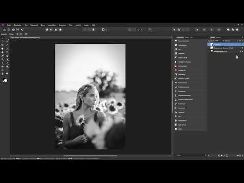
The video is only loaded from YouTube when you play it – data (including your IP address) is then transmitted to YouTube/Google. More in the privacy policy
It is assumed that you have already converted your color image into a black-and-white image. If you have not done that yet, the tutorial on black-and-white conversion will help you.
Key Takeaways
- You create a vignette as a Live Filter layer. Exposure, hardness, shape, and scale can be readjusted there at any time.
- A soft edge looks more natural than a hard one, and an ellipse usually suits portrait-format images better than a circle.
- The sepia tone is created via a fill layer in the "Color" blend mode. With the blending options, you protect the highlights from too strong a tint.
- With a gradient map and a color balance adjustment layer, you control shadows, midtones, and highlights separately from one another.
- Different paths lead to the goal. Try out several variants and choose the one that suits your image.
Step-by-Step Guide
Step 1: Create a vignette as a Live Filter layer
First, select the top layer in the Layers panel. Then, via the menu, create a new Live Filter layer of the Vignette type. This way, your black-and-white image remains unchanged, and the darkening sits above it as a separate layer.

Step 2: Darken the edges
In the vignette dialog box, you will find the slider for exposure. It initially sits at zero, so the image remains unchanged at first. Drag the slider to the left to darken the edges. You can also brighten the edges, but for this mood you should choose darkening. At first glance, the effect often still looks too strong, but this can be corrected in the following steps.

Step 3: Soften the transition with hardness
With the hardness slider, you determine how smoothly the vignette blends into the image. High values produce a hard edge with strong contrast. Low values create a soft gradient that looks significantly more harmonious. For most subjects, a soft transition is the better choice.
Step 4: Convert the circle into an ellipse
In a portrait format, a perfectly circular vignette quickly looks out of place. Therefore, briefly increase the hardness so you can see the shape better, and then reduce the shape value. The circle becomes an ellipse that adapts to the image format. Afterwards, reduce the hardness again to a soft value.
Step 5: Position the vignette via scale
With the scale, you determine how far the vignette extends into the image. If you enlarge the shape, the darkening moves toward the edge. If you shrink it, the effect looks stronger and encloses the subject more tightly. Combine the scale with the exposure until you like the overall effect. It is important that attention is actually guided to the center of the image.
Step 6: Reduce the opacity and blend
If the vignette is too dominant, reduce the opacity of the layer. Afterwards, you can have the layer blended with the layers underneath. This way, the effect fits more gently into the overall image. The vignette is now complete, and you can begin with the sepia tone.

Step 7: Create the fill layer for the sepia tone
Select the top layer again and create a new fill layer. It must lie above the vignette so that it affects all layers beneath it, including the vignette. The fill layer initially appears in white. Change the layer blend mode from "Normal" to "Color". From this moment on, every color change directly affects your image. It is best to rename the layer to "Blend mode" right away so that you keep an overview later.
Step 8: Choose the right sepia hue
With the fill layer active, click on the color swatch to open the color picker dialog. Choose a brown tone that is not too strongly saturated, because otherwise the image quickly looks artificial. You can adjust saturation and brightness separately. A slight warming of the hue enhances the typical sepia character. Test different tones until the result suits your subject.

Step 9: Protect the highlights with the blend options
So far, the coloring also affects the bright areas of the image, and that often looks unnatural. Therefore, open the blend options of the fill layer via the small gear icon. In the section for the underlying layers, drag the right handle downward. This makes the bright areas of the underlying layers visible again, and the highlights remain largely unchanged. Also add another handle point in the middle of the diagonal so that the midtones retain their original look.

Step 10: Avoid a hard edge
By default, the "Linear" option is active. If you then drag the handle downward, a clearly visible edge appears. Disable this option to get even and soft color transitions. Afterwards, you can move the handle further down and to the left until the bright areas are hardly affected by the coloring anymore. You can reopen and adjust the settings at any time later via the gear icon.
Step 11: Refine the sepia toning with a gradient map
Temporarily hide the fill layer and next choose an adjustment layer of the Gradient Map type. The gradient initially shows a completely different color distribution. Remove the middle handle so that only two handles remain. The left handle controls the shadows, the right one the highlights. Set white for the highlights. For the shadows, choose a dark brown tone and desaturate it strongly. This creates a warm but restrained depth. Rename this layer as well, for example to "Gradient".

Step 12: Balance midtones and saturation
Add an additional anchor for the midtones and color it as well. Make sure that you use the "Color" mode when selecting the color and do not change the hue. This way, you always work with the same tone and only control saturation and brightness. Adjust each area accordingly and move the handles until the recoloring looks even. If the result appears too colorful, reduce the saturation of the midtones a little.

Step 13: Balance shadows, midtones and highlights with Color Balance
Color Balance is the third adjustment layer in this workflow. Open it via the adjustments and first select the Shadows tonal range. Carefully drag the color sliders toward red until the dark areas take on a warm tone. Then subtly add magenta and yellow. For the midtones, proceed similarly, but with much lower values. Every image reacts differently, so you have to base the values on your subject.

Step 14: Fine-tune the midtones
Switch to the Midtones tonal range and tint them very subtly. A little red, some magenta and a hint of yellow ensure a harmonious transition between shadows and highlights. Keep looking at the image as a whole, because the fine-tuning determines the effect. Too much color quickly looks like a filter, whereas less color looks more authentic.

Step 15: Compare the result with the variants
After finishing, you can compare the original with the edited image. In addition, the video shows you three possible approaches: the fill layer in blend mode, the gradient map and the color balance. Each approach delivers its own result. Experiment with all three and choose the style you like best. Your personal look often only emerges after several attempts.
Summary ??? Sepia toning in Affinity Photo: Refining black-and-white images with a vignette
You have learned how to guide the viewer's gaze using a vignette as a live filter layer. You now know how to adjust brightness, hardness, shape and scale, and why an ellipse often fits better for portrait formats. You have also seen how a fill layer in the "Color" blend mode, together with the blend options, creates a sepia toning in which the highlights remain protected. Gradient map and color balance give you additional control over shadows, midtones and highlights. Use these tools as a starting point and develop your own style.
FAQ
How do I create a vignette in Affinity Photo?You select the top layer and create a new live filter layer of the Vignette type, so that you can still change all settings later.
Why does a circular vignette look unsuitable for portrait-format images?A round shape rarely fits the aspect ratio of a portrait format, so you convert the circle into an ellipse using the hardness and the shape adjustment.
How do I achieve a soft transition with the vignette?You reduce the hardness slider until the transition between the darkened edge and the center of the image looks smooth.
How do I prevent the sepia toning from covering the highlights in the image?You open the blend options of the fill layer via the gear icon and drag the handle for the underlying layers downward so that the bright areas become visible again.
Why should the "Linear" option in the blend options be disabled?When the option is enabled, hard edges appear when moving the handles, while disabled settings allow even color transitions.
Which blend mode is suitable for sepia toning?The "Color" blend mode transfers the chosen hue to the image while the brightness of the black-and-white original is preserved.
How can I specifically adjust the color of the shadows?You use the gradient map or the color balance in the Shadows tonal range and change the hue and saturation there.
Do I have to create a black-and-white image first?Yes, sepia toning works best with a black-and-white original that you have previously created from a color image.


